9 Ecommerce Design Trends
to Follow in 2026
 10 mins read
9 Ecommerce Design Trends
to Follow in 2026
10 mins readThe ecommerce graphic design always forms the first impression. This is why you need to develop a corporate style for your business, which is not just about the appearance. It is all about the concept of your ecommerce business. It is all about the structure, convenient menus, clear navigation, quality product photos and content. Getting acquainted with the latest ecommerce design trends will help you to develop a modern design that will invigorate the user activity and bring sales.
The world of design never stands still: old trends rapidly lose their relevance, yielding to new ones. In this article, we will talk about the main ecommerce web design trends to follow in 2026. Understanding them will help you to convert visitors into customers faster and maintain your position in the competitive ecommerce market.
Convenience. The time the user spends on the site and the depth of browsing the pages depends on how intuitive the navigation is and how logical the structure is. It is necessary to plate all important blocks in the visitor’s viewport, create clear transitions and visible CTA buttons.
Aesthetics. The first thing that the user pays attention to is the attractiveness and relevance of the online store, that is, how well it corresponds to modern ecommerce design trends and the specifics of the represented business. A beautiful and stylish website makes you want to stay and study the information in detail.
Simplicity. The site must be understandable for users, so that they can easily find what they need, understand what and how they need to act to reach their goal. In addition, brevity is important. The absence of excessive graphics simplifies perception, while the accumulation of various details can cause irritation.
Functionality. Modern ecommerce graphic design trends are all about the adaptive layout and complex functionality, which includes the integration with CRM systems, shipping services, payment gateways, and other services.
Uniqueness. The graphic design of your store should not copy other resources and still should have unique and high-quality content, that is, useful, relevant and not “borrowed” from competitors.
Constant maintenance. An effective website is one that is available to users 24/7.
SEO. Internal and external optimization of an ecommerce website will allow search engines to see, recognize it and bring it to the top of the search results, which will boost your organic traffic.
An online store that meets the main criteria will become effective. After all, then it will be convenient, accessible and interesting for the audience, as well as understandable for search engines and different from competitors.

Contact Professional Ecommerce Development Company
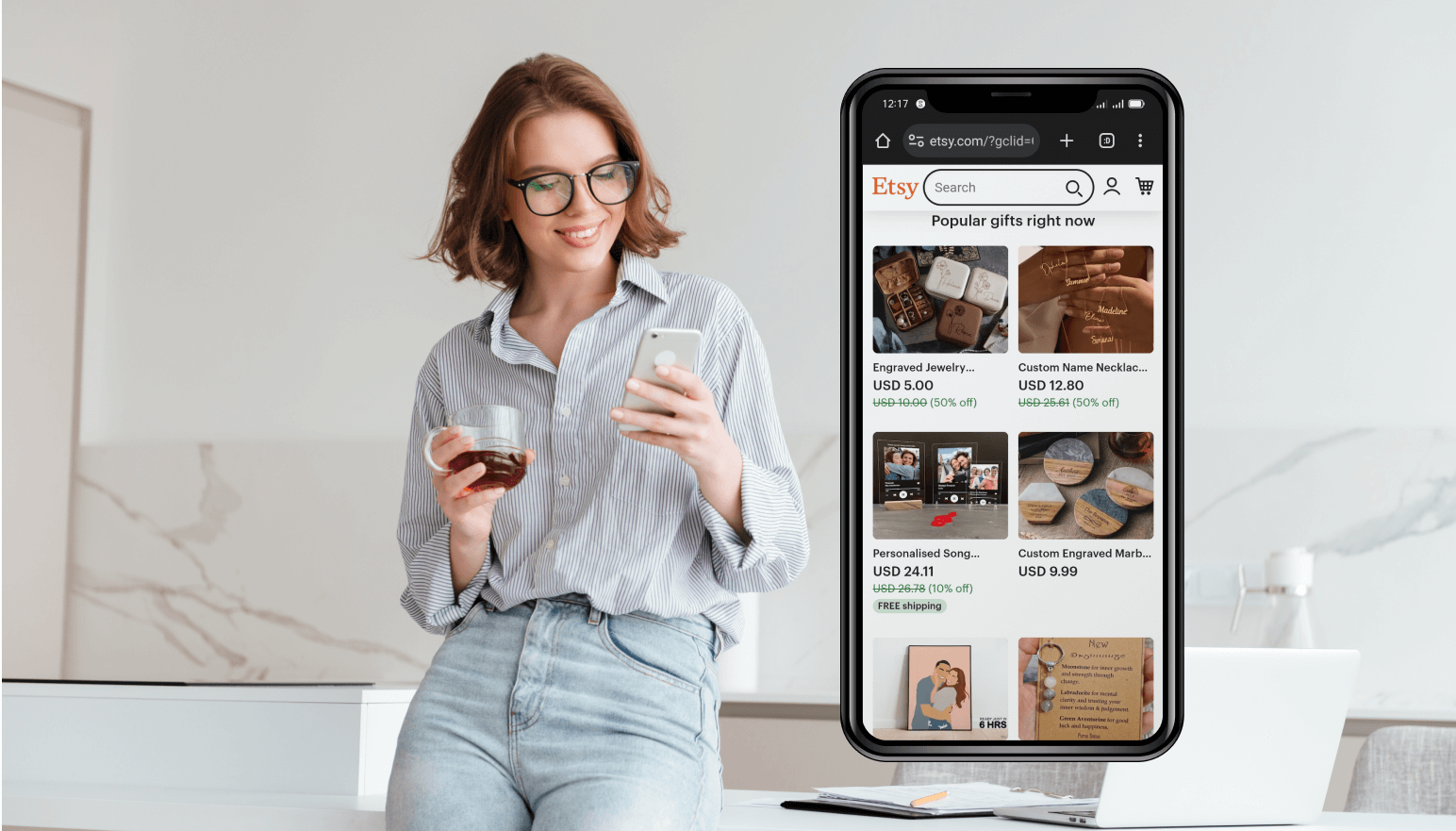
Actually, mobile ecommerce design optimization is not a new ecommerce design trend for 2026, but it is extremely important to be mentioned in this article. According to Statista, more than 50% of users are already using mobile devices for online shopping, and this number continues to grow. Therefore, in order to attract and retail this audience, merchants must develop sites that meet the highest standards of mobile ecommerce design optimization.
Responsive design is another important trend that you should consider. Since online shoppers use different devices with different screen sizes, websites must be designed in such a way that their content can be viewed comfortably on any device. Adaptive design ensures maximum user satisfaction when browsing the site.
Below, we add a short list of 9 mandatory rules for a mobile optimized ecommerce store in 2026:
You can achieve a high level of communication with the brand with the help of ecommerce UI/UX design personalization. It also makes site navigation more convenient. Thus the implementation of personalized experiences into the system interface can increase usability. As a result, the client receives a higher level of satisfaction from interaction with the site, which converts into increased sales.
Personalized UI/UX is one of the ecommerce web design trends. Personalization is based on the data collected by the system and its processing with the help of artificial intelligence. Personalization works well when it is in sync with the users needs and addresses them. But preaking of personalization, you can’t ignore customization as well.
Personalization is a system customization made by developers. Its purpose is to recognize the user, their compliance with pre-configured segments, and then show them only relevant content, necessary information and useful tips. After the implementation of personalization, all the content of the site, its visual element, and functionality can be shown to different users in different ways, based on their needs and interests.
You can implement personalization at different levels:
The usage of animations is one of the important ecommerce web design trends. Users love animations because they create the effect of real “live” communication between them and the website. Animations also repeat the sensations that users get when interacting with physical objects in reality.
Animations are not just popular. Today they are practically necessary for most online resources. UX animations, in addition to the gaming experience, provide a lot of benefits to business owners. Let’s see what types of animations are popular now, why they are needed, and which animations might be useful for your business in particular.
Micro animations are used for buttons, links, sliders, icons, and other clickable elements on the website.
Features: prompt the user to take simple clear actions they might have forgotten or just didn’t think about: for example, click a link, write a comment, switch to a next page, etc. micro animations give an understanding of which button to press and what to expect next.
Large animations are used when you need to make a unique site where different content elements and blocks interact with each other.
Features: online stores with the animated layout are usually very creative, look great, and show the overall level of the company. It makes customers interact with your online store more and, if done right, guide them through the website right to the checkout.
There are many examples of vivid and effective use of logo animation. The key factor here is the movement of elements, capable of telling a whole story in 1-3 seconds.
Features: with the help of animation, logos become more modern, brighter, lure the user from the first seconds and communicate the necessary information about your company. Successful logo animations carry not only information, but also an emotional charge. However, animation of logos should be approached very carefully so as not to distract the user from solving their main goal, namely, making a purchase.
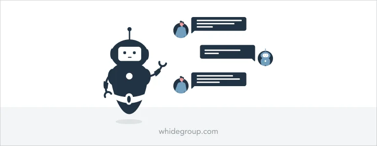
Today, artificial intelligence (AI) is taking over everything from copywriting to data analysis. The technology will not replace a web design specialist, but it can bring them an effective result and new opportunities to communicate with the audience.
One of the simplest AI tools that can be implemented on an ecommerce website is a chatbot. It serves as a virtual assistant, giving customers the opportunity to ask questions, get basic support or even place an order.
Here are a few facts about the chatbot technology to convince you that it deserves your attention:
Ecommerce design trends are not limited to essential elements such as style or graphics. Text and color matter a lot, especially when it comes to headers and backgrounds. So let’s figure out what exactly in web design trends can be attributed to this group.
A monochrome color palette involves the use of one main color for the entire site design. This ecommerce design trend can be considered multifunctional, because a page made in one color always attracts attention and does not make the eyes strain when viewing.
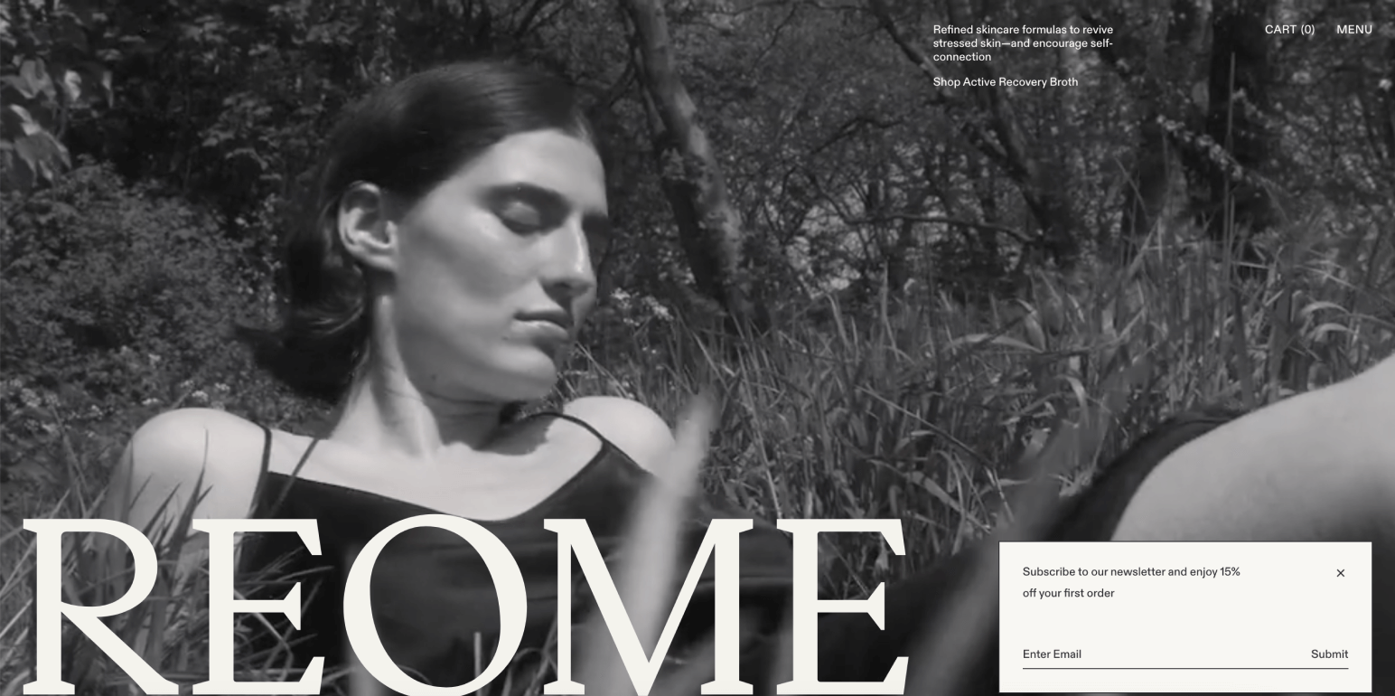
Monochrome design is quite versatile: it is suitable for almost any ecommerce business type. In addition, the use of a single color makes other elements of the page stand out. So if you think that a great website design should include all the colors of the rainbow, check out the Reome store. Does it look boring?
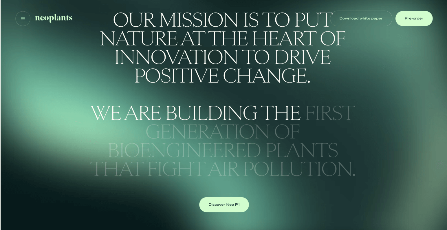
A gradient is a transition of colors from one to another. It can be single-toned, two-colored or multi-colored. This ecommerce design trend is usually used to add depth to a flat design. It creates the illusion of movement, gives the store a fresh and modern look, and suits everything: logos, backgrounds, graphics, etc. Just look at how the Neoplants managed to use all the advantages of the single-toned gradient.
Usually in ecommerce UI design, all elements are in their own space. This allows users to enjoy each of them. If you want to stand out with your online store layout, pay attention to layering or overlapping – partial placement of one element on top of another.
How can this be implemented effectively?
Keep in mind! When implementing the overlapping effect it is especially important to take care of responsive web design. Layers that have been superimposed on each other can make it difficult to perceive the information on mobile devices or tablets. Sometimes this leads to the partial unreadability of the content.
Minimalism is one of the most stable trends of recent years. The secret of its popularity is that the cleanliness and simplicity of the ecommerce website is a key to convenience, functionality and charming aesthetics.
Minimalism in the context of ecommerce web design has numerous advantages:
Sometimes, taking classic minimalism to extremes, experts challenge conventions and create ultra-minimalist site designs, leaving only the essentials in them.
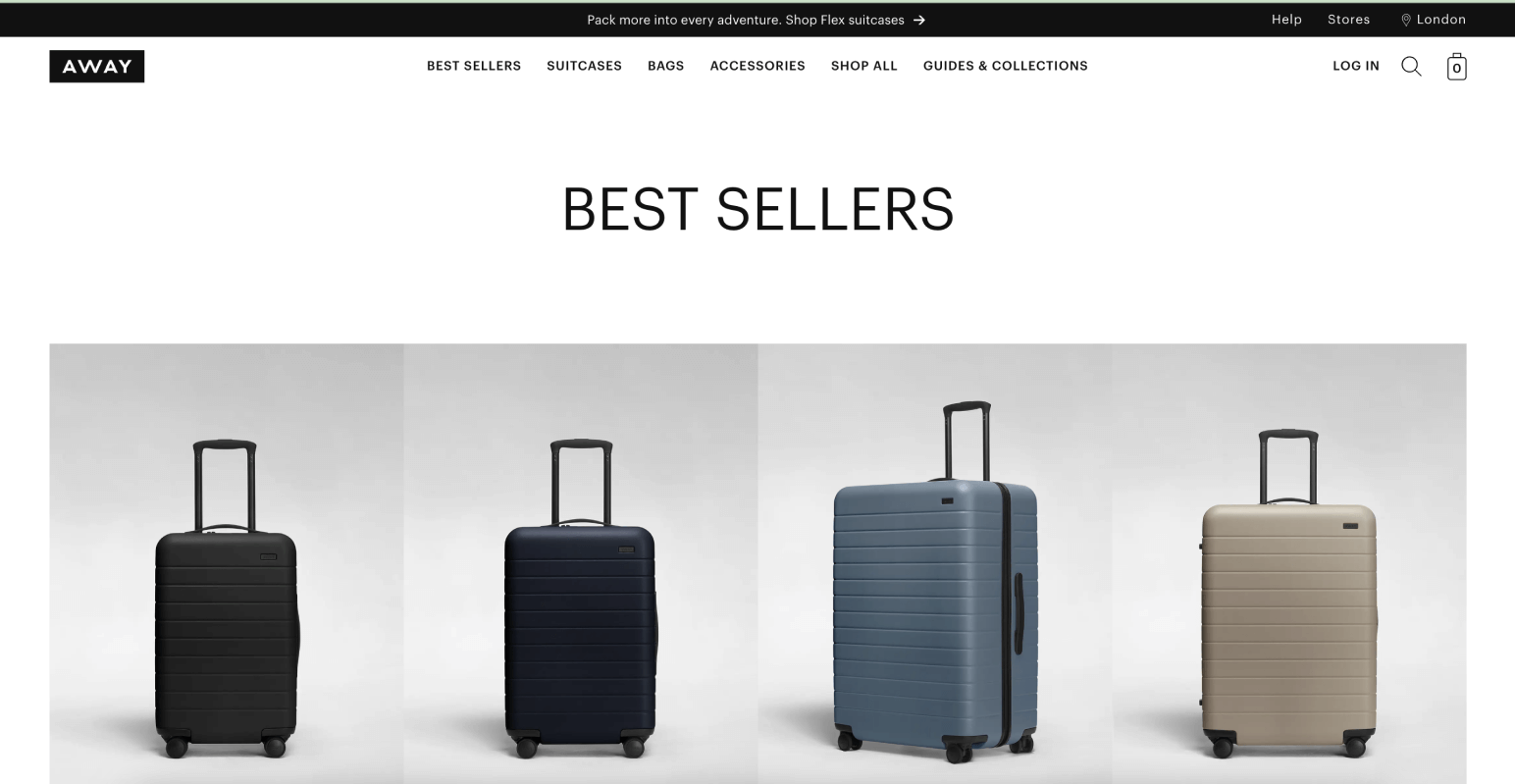
Classic minimalism is characterized by a minimum of options, a lot of free space, a limited color palette and bright, noticeable typography. Such ecommerce design trends are especially popular among companies that want to convey a sense of sophistication and professionalism, for example, Awaytravel.
You have to shorten the customer’s journey through your store by all means. There are four actionable methods for this: optimized product categories, breadcrumbs, product search, and recommended products section.
All products in your online store should be sorted by categories. For example, if you sell sneakers, the root category should be “All sneakers”. Categories of the second level can include: “Women’s sneakers”, “Men’s sneakers”, “Kids’ sneakers”, and so on.
Breadcrumbs is a kind of categorization of your products in the form of text. Most often, breadcrumbs are placed at the top of the product and category pages, just like in the screenshot below.
With the help of breadcrumbs, the user will be able to jump back to the store section they need and continue browsing through the catalog.
Be sure to add the ability to quickly find products by name. Not everyone wants to browse endless category pages in search of the single needed product. Sometimes, customers know exactly what they are looking for and want to know whether your website can offer them what they need.
For each product page, you can add a special block with recommended products. If the current product does not satisfy the needs of a customer, they can quickly switch to another similar or additional product.
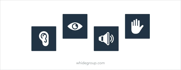
Inclusivity and accessibility are more than just ecommerce design trends. There is a growing need to consider the needs of people with disabilities when designing online resources of any kind. Having an ecommerce store that, literally, every user can easily navigate and interact with is more than just providing quality customer service and a great shopping experience. This can increase conversions, boost your SEO, and help you reach a wider audience.
These are several elements that will improve your website accessibility:
Direct advertising, rudely imposing any product or service, often repels the target audience. Using storytelling instead of direct advertising helps to convey information in such a way that customers can better perceive and remember it. Storytelling does not contain aggressive formats and imposed opinions. Competently written, engaging stories influence the potential customer behavior and help to achieve the following goals:
An archaic ecommerce web design can significantly reduce its conversion rate. Numerous heavy elements, chaotic arrangement of blocks on the page, inconsistency of color palette, typical and template solutions distract the visitor and thus reduce the efficiency of your business.
In turn, ecommerce web design trends that you should consider in 2026 reflect the rapid development of technologies and changing user needs. These trends envision increasingly personal, convenient, and interactive online stores that cater to users’ needs and preferences.
From dynamic design, deep personalisation, to animations, inclusive design and ethics – these ecommerce design trends show that web design continues to evolve, prioritizing not only aesthetics but also functionality, accessibility and importance for users.
If you want your future online store to meet the latest ecommerce design trends, contact us and we will help you to implement the boldest expectations in terms of design as well as functionality of your ecommerce store.

 Top 7 Reasons to Choose Hyvä Theme for Your Magento 2 Store Upgrade