8 Reasons to Optimize
Your Website for Mobile
 8 mins read

8 Reasons to Optimize
Your Website for Mobile
8 mins readWhat is your favorite go-to device for entertainment & shopping: a laptop, tablet, or phone? Our guess? You probably quickly said your phone. If you’re like most users, you’re probably even reading this article on your phone. What encourages us to keep our mobile devices in hand the whole day? The answer is simple. Modern phones are so pimped out and convenient today that they are even apt for making movies. Naturally, it makes sense that websites optimized for mobile will prevail. If your website still isn’t at this party, take a look at the benefits you’ll get after making it mobile friendly.
The rapid increase of smartphone popularity has resulted in a tendency for mobile website optimization. According to Manochi, there were 5.83 billion unique mobile phone subscribers in April 2026. This information means the potential for more conversions, allowing you to grab a piece of delicious cake, right? However, many websites are far from being ready to interact with users in this territory.
Approximately 50% of smartphone users never recommend ecommerce businesses with unfriendly mobile websites. Such brands have probably given little effort in website optimization for mobile, but does mobile optimization really matter? What turns mobile users off from online stores that aren’t mobile optimized?
First of all, loading pages with heavy content takes much longer on mobile devices than on desktops, and quick loading is crucial for conversions. Images created with a view for desktop aesthetics can turn small and blurred while zooming on a smartphone. In short, the best website design on a desktop may not necessarily be very adaptable to phone resolution and dimensions. Not to mention, loading a complex website eats up data, which can be another huge deterrent for customers, depending on their data plans.
The mess created on a smartphone by a website not optimized for mobile is important to consider. When these pages are displayed, they often look broken and dishevelled, with irritating consequences such as the main navigation bar covering important parts of the website, which causes annoyance to the customer.
Is this an experience you want to provide to your customers? Doubtful! Website optimization is a necessity for you to be liked by customers. Online shoppers don’t have the patience to navigate cumbersome sites, and this is just the first of many reasons why we advise clients to optimize an ecommerce website for mobile devices.
The above-mentioned numbers can shock the conscience as an ecommerce business owner. However, they do also give you tremendous incentive to upgrade your online store for the mobile field. If you still have doubts, we are ready to make a case so convincing, it will be hard to resist!
The first thing you need to think of when building an online store is customer need. Shoppers require not only a good price, the best product quality, and pleasant customer service, but also an engaging experience interacting with your e-store. Regardless of whether they visit you on a huge screen or smartphone, laptop or tablet, regardless of what brand is it, a customer should be able to easily communicate with the website.
In 2015 Google surprised ecommerce business owners with an update to their algorithm, in which they revealed that multi-device responsive websites rank higher in search results. The lesson? Google applauds a website with high performance, a strong layout, content to fit the screen, optimized buttons, positive UX, adapted to mobile images, and with an added meta viewport tag.

What positive effects can responsive design have on your customers and your online business? Users want to interact with your website without moving from side to side or zooming. With no effort, they want to navigate your website, nonchalantly searching for a soft beanbag chair or a sweet notebook with kitties on the cover. In exchange, you get customer loyalty, high conversions, low bounce rates, and many other benefits.
It’s worthwhile to mention another reason you need to optimize your website for mobile… traffic! Guys can buy food for dinner while watching TV, ladies can purchase lovely hangers and pots for their houseplants while commuting to work. People are absorbed in their smartphones and tablets everywhere and all the time! Such behavior causes the continued prevalence of mobile traffic over desktop computers (52.27%). Take advantage of these trends. After all, a steady stream of mobile traffic means more conversions on your store.
Additionally, we advise clients to consider launching a progressive web application (PWA) that will definitely help you get more traffic. A PWA looks like a real mobile application, is built as a simple webpage, and displays on Google as a website. Speaking of benefits, we would like to point to the lower development costs, the small size of the application, high web performance, and much more. For more about how you can win using a PWA instead of a website for your online store, check out our article on the subject.
You still have to keep in mind that PWA development takes more time than mobile website development. It also requires a different approach and experience if you want the PWA working on different mobile operating systems. Hence, it is necessary that you clearly understand your business goals and the related possibilities.
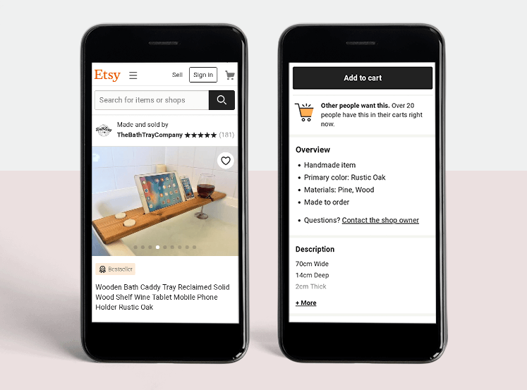
Let’s talk a bit about mobile applications development. Ecommerce enterprises spend a lot of money to develop them for business. Among the brightest examples, we can call Aliexpress, Movavi, BestBuy, Joom, CCleaner, Etsy, Mango, etc. Mobile apps certainly help an ecommerce business expand the potential audience, get more sales, and become entrenched as a word-of-mouth company.
You also need to remember that apps for Android and IOS require a different approach in their development, without which, they won’t work properly. So, you may wish to spend money on the more cost-effective project – mobile website development. By optimizing your site for mobile, you also benefit from the time required for development. Because they are simpler and easier, such websites can be developed within 118-164 hours (app development takes from 642 to 968 hours).
The ecommerce world transforms in conjunction with changes in customer behavior. Mobile consumers require another approach to their personality than those using a desktop. Because of this, you want to make sure you follow the right priorities in the customer journey. Do a little research to glean pieces of helpful information, such as what step mobile users take first, or what sections they seem to click more. Another piece of advice? Create registration and login via social media as it tends to be more preferable and comfortable for customers.
When using mobile, the customer hopes that everything they need now or later will easily be at hand. We would even say – at their fingertips! The possibility to sweep uninteresting products away like unwanted dust, filter items by just tapping the screen and scrolling down, and swipe sections one by one at the product page like “About the item”, “Description/Features & details”, “Reviews”, are all aspects that make shoppers swoon. Other conveniences that make customers happy? Sticky buttons like “Compare”, “Shopping Cart”, “Wish List”, and “BUY NOW” standing together like old pals.
In fact, mobile users prefer visual content more than written. They adore bright images, interesting videos (especially product ones), and moving banners. A social, active online store that sells, while demonstrating customer experiences with their product, gets a lot of kudos, especially among young people.
If your content is hard to read, and your images are barely visible while zooming, shoppers will stop spending time on your website from their mobile devices and will most likely turn their back on the brand. Even free shipping and sales for the next purchase won’t save you when, instead of a perfectly cut diamond, a customer sees a showcase of grey pixels.
The unoptimized online store pushes customers to abandon the website with a quick tap, and probably an eyeroll, which means increased bounce rates from tablets & mobiles. With such a high percentage of bounce rates, you won’t gain customers. You’ll merely have a cache of dissatisfied users. With a user-friendly website, that cache will decrease. It’s simply another good reason to optimize a site for mobile, isn’t it?
Your website can attract customers from the desktop and generate high conversion rates. However, at the same time, good-looking desktop-focused websites reduce these conversions on mobile. Why does it happen? Low website performance is annoying to users, as they lose patience with the obscured CTAs, unclickable links, and unoptimized checkout. Such provocation can see even the most laid back online shopping connoisseur tap their favorite smartphone several times in a temper and even briefly consider throwing it out of the window as a solution.
Impatient mobile users will just leave your site without giving it a second thought, causing serious damage to your conversions. However, clear CTAs with clickable contacts and a smooth customer experience will improve the situation immediately. Mobile users are known for making their purchases impulsively, which is why you need to make their interaction with your brand memorable and happy.
Mobile websites work without redirecting from page to page, which helps to reduce the time users take to search for the product they want. By simply enjoying the ease and quick transfer from one page to another, users delight in the warp-speed, become relaxed and settled-in, and spend more time at your online shop. Create an eye-catching mobile website and you’ll conquer the ecommerce world!
The normal speed for desktop websites to load is 1-2 seconds. 3 seconds is already too long for mobile websites. As we’ve already hinted, after optimizing your site for mobile, it will run faster. What saves loading time? Media content automatically adapts to the correct resolution. Text will also adapt to the right font types and sizes without a hitch.

The usage of HTML5 instead of Flash also increases website speed, which is especially an advantage for mobile devices with slow internet connection. Another thing to note is that pop-ups can be hard to close, that’s why we advise you to either fully optimize or avoid them altogether. Other keys to boosting the speed to your online store include reducing redirects, utilizing browser caching, and minifying code.
A good mobile experience does not end at “the page fits the screen.” Shoppers now use their phones to browse products, compare options, and buy online, so every awkward step can cost you a customer. Deloitte Digital also points out that people respond better to mobile experiences that feel personal and relevant.
For a Shopify store, mobile optimization should therefore cover not only speed and responsive design, but also the details that make shopping easier. Pay attention to clear product pages, helpful recommendations, saved preferences, simple navigation, and a checkout that does not make users fight their own phone.

At the same time, if your website is not ready to welcome mobile users, the word-of-mouth strategy will be your enemy. Customers crave convenience and will likely simply visit your competitors rather than hop on their laptop to buy from your store. Don’t risk your sales and conversions – optimize your ecommerce website for mobile devices.
Every second matters, especially in m-commerce! Every characteristic of your mobile website plays a role and leads to increasing conversions or seeing a drop in them. Users count on a smooth interaction and positive experience with your online store. All of the above-mentioned reasons surrounding website optimization for mobile are crucial for every ecommerce project. If you’re ready to hold all the aces and want to break through to a new ecommerce level, Whidegroup is here to help you achieve it by optimizing your site for mobile.

 How Much Does It Cost to Start an Online Boutique in 2026: The Breakdown