7 + 1 Tips for
Ecommerce Checkout Page Optimization
 12 mins read
7 + 1 Tips for
Ecommerce Checkout Page Optimization
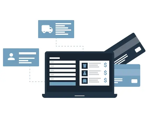
12 mins readYou can think of every detail you need to make a website fast: optimized code and images, high website performance, web hosting analysis, minified CSS & JavaScript performance, and much more. However, UX optimization doesn’t guarantee that visitors to your store won’t abandon their shopping carts. Indeed, if you forget about checkout page optimization, all your efforts might be in vain. Below, we sort out some tips to optimize your checkout process.
It’s about more than just making the checkout mobile friendly. You need to take further marketing and development steps to achieve great results. In this article, we explain how you can optimize your website’s checkout process. Why does this matter? For starters, a simple checkout makes your customer’s life easier.
Remember those frustrating days when you had to fill out about a dozen fields on the checkout page? And half of these fields seemed so silly or complicated that you fought to stop yourself from just clicking the close button instead?
Unpleasant feelings never result in a good experience. Your customers should feel at ease and unencumbered while making their final step in the purchase process. You can help by requiring a minimum amount of checkout fields, with the titles placed above or inside the field. If any of the fields are a must, simply highlight them with an asterisk. In short, do as much as possible to ease your customers’ journey through your store. It’s the best way to keep them coming back.
A study on mobile checkout processes done by Moovweb, showed that among 1.8 million mobile users, approximately half used guest checkout. Surprised? The secret is simple. Put yourself in the customer’s shoes: you’re entering a website for the first time, you may have doubts about the website’s credibility, its customer service, payment or delivery processes, or anything else.
Users may simply come to your website with the intention of making just one, single purchase. Having to sign up to continue checkout will likely scare them off. You hardly want to lose potential customers (who might even turn into promoters of your business later on!). The solution is clear: implement a guest checkout on your site.
Of course, it does depend on the products you sell, as especially with expensive products, the risk of fraud heightens and exchanges and returns are more likely to occur. However, a guest checkout is a real gem for customers with poor internet connection or who have old mobile devices.
What’s the major focus of your store? Undoubtedly, it’s the products you sell. However, business owners can sometimes pay too much attention to their web design or digital marketing, and actually lose sight of their product. Such a gaffe often leads to unmade purchases or returns.
To combat this, provide all the product data that customers will want at the checkout page. Give them the opportunity to verify their order again, especially if they’ve ordered products of different kinds and categories. Technical aspects, color, size, quantity, item availability, etc., should also be obviously displayed both in the shopping cart and at the checkout page.
This small, simple implementation reduces shopping cart abandonment percentage (hello, profit!) and increases the chances of happy purchases (a win for buyers!). We can’t emphasize enough how important it is to optimize your checkout page by repeating the product details for your customers.
Dealing with money can be a challenge for consumers, so keeping the checkout process simple and smooth is key. You want to let nothing distract customers from moving forward with their personal & payment data.
Some things to consider are leaving out footers or headers, as well as related products, etc. There are only a few things that really should be on the checkout page: fields with easy-to-fill-in forms (card number & CVV fields should be last), the customer’s order, your logo, a live chat option, and the store’s contact information.
Additionally, add checkout buttons to the upper right corner and, if possible, to the bottom of the page. While scrolling down and selecting products, a customer will tut at having to scroll back up through dozens of products to complete the sale. Providing the route for a simple tap of the checkout button to finish the purchase is optimal.
If you have no CTAs regarding your privacy policy, or information on shipping & returns at the product page or on the shopping cart layout, we recommend either adding them, or leaving a footer intact that includes this necessary information. It’s always good to drop the hint to your customers that they should make acquaintance with your policies before the final step.
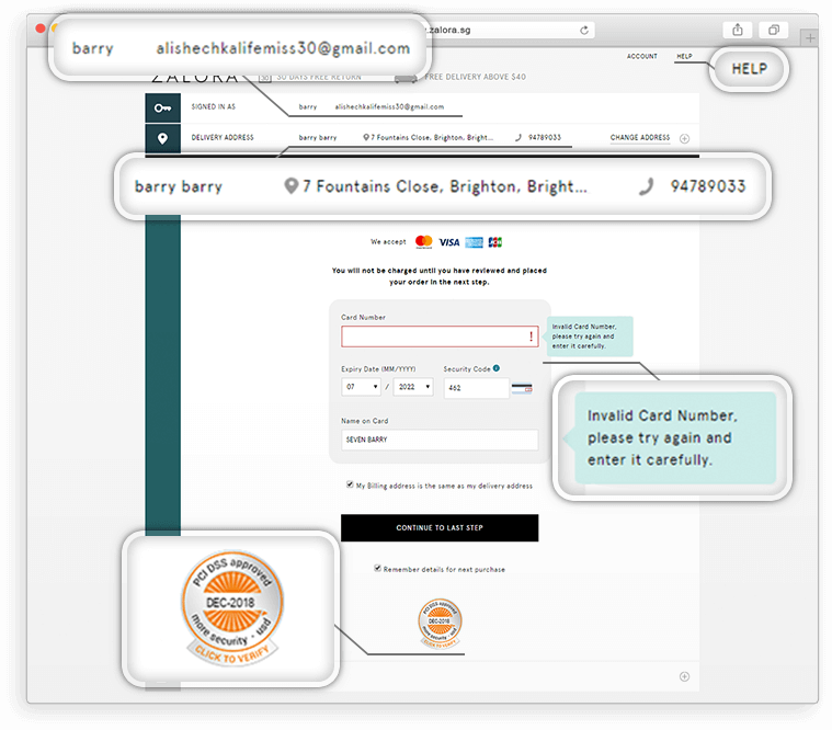
Web marketing company Blue Corona is convinced that website security is crucial for 84% of users. What does this mean for you? Potential customers will likely stop purchasing if they catch wind of an insecure connection, thus leading to a high percentage of shopping cart abandonment and, of course, reduced sales. So, it can be argued that website security is another piece of the puzzle for your store.
To make your online business run great, you can integrate different credit card systems and security seals in the footer of your website. This addition will do wonders for your online store! Trust badges don’t just verify the validity of the page as proof of protection for your information as well as your customer’s, but they also help bolster your store’s credibility.
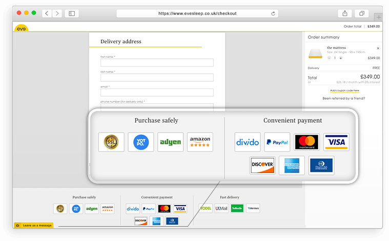
It’s great when you can be flexible and provide multiple payment options! Customers have the opportunity to choose the option that works best for them. Moreover, avoid using third-party websites to manage payments. Keep users on your domain during the whole payment process. This will ensure that they stay calm and confident that their money and information will be in the right hands.
Another way to make the customer’s life easier is by providing a multi-currency switcher. While managing the multiple currencies that you’ve added, the platform displays the price in the consumer’s local or chosen currency. It also recognizes the user’s IP address and automatically changes the currency to match the customer’s at the checkout stage.
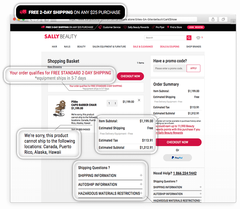
The most frequent cause of shopping cart abandonment is always shipping issues, whether it’s a high shipping cost, a low price order that negates free shipping, having to re-enter shipping info, or especially, a store that shocks with a last-minute reveal of shipping and handling costs. What’s the point in hiding costs until the end, and then losing wouldbe customers? Be transparent and honest about shipping from the start.
Provide as many shipping methods as possible and display the options on the checkout page. You can even win points by specifying the approximate shipping date, which will let your customers feel more trusting. If they’ve got the possibility to get free shipping, let them know about it: “Congrats – you get free shipping!”, “Free pickup available!”. Encourage your customers – attract them with an offer like “Free shipping from X” in the header.
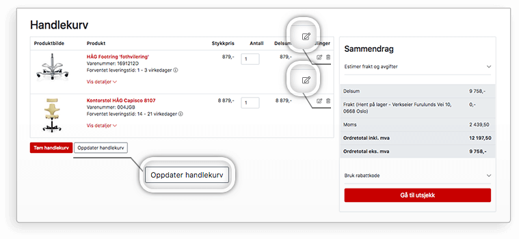
We all know that before making a payment, it’s best to check your order again. And if you purchase several items in different quantity, it would be better to reveal all necessary information on one page. It should be quantity, item price & estimated subtotal, estimated tax, shipping costs & other shipping-related information. It’s better to implement them in the shopping cart, but in a pinch, you can also do it on the checkout page.
If you sell services or digital products, give users a detailed guide on how, when & where to get or download them. If the shipping & downloading process is complicated, help your customers by providing video instruction with all required explanations.
Business owners spend thousands of dollars on customer service-related efforts to win their customers’ hearts and build a solid buyer experience. Good customer service is a foundational brick of every ecommerce business, and it is imperative that you take care of it every day, although you can’t always expect immediate results.
What are some of the ways to make your customers happy? Like we mentioned above, the first thing to do is to provide excellent customer service. Consumers shouldn’t experience difficulties in reaching you if they have questions. Often people need help not only before they’ve made a purchase, but also afterward. You need to be ready 24/7 to answer buyers’ questions. The use of Live Chat, a 24-hour line, and/or chatbots is very useful.
You can also consider providing gift cards, coupons, and discount codes to please customers. And it really works! 61% of users rely on discounts and coupons, thereby purchasing more and more, and handing their loyalty over on a silver platter. A good position for such notifications is to place them below the order at the checkout page, as a separate field.
Draw attention to it by way of a catchy heading like “Do you have a discount code?”, “Use Promo Code”, or “Use a Gift Card”. Many ecommerce businesses use this smart tactic to increase their customer loyalty. What better way to make customers happier than leaving little presents for them?
Give your customers the choice to change the quantity of the item or to completely remove it from the cart. If the customer still hesitates, let them save the product for later or add it to their wish list. When they add a new item to the shopping cart or their wishlist, you can highlight it with a simple notice message.
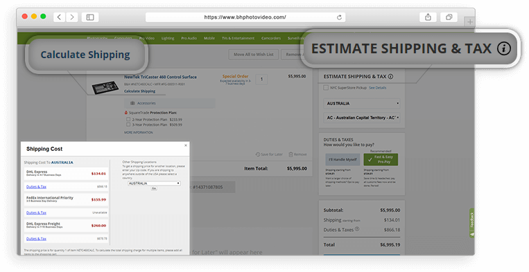
To keep customers from getting surprised by shipping costs or taxes, implement a “Calculate Shipping” option, available during the checkout process. To calculate the total shipping charge for multiple items, the customer merely has to add them to the shopping cart. If you have special shipping conditions for particular products (fragile, unique products, etc.), be sure to highlight it either at the product page or in the shopping cart. The financial side, such as taxes and shipping, should be resolved before your store browsers become customers.
Above we gave you checkout page optimization tips to help you boost sales on your ecommerce website. Next, we’d like to draw your attention to examples of online stores which, thanks to an optimized buyer’s journey, go off with a bang in their ecommerce industry.
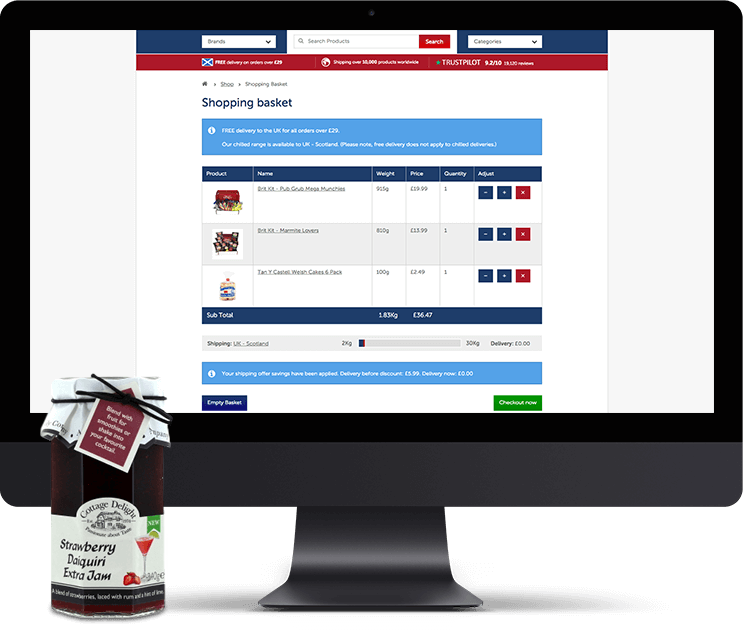
Specializing in delivering UK food & drink around the world, this online British supermarket is highly regarded among its customers. The site demonstrates fast load time and optimized images. All static files (like CSS and JavaScript content) are minified.
When adding products into the basket, customers see the relevant information with their order, such as: the amount of desired items, delivery country and costs, subtotal, and two CTAs – “View my Basket” and “Continue Shopping”. Organized in a table structure, this shopping basket is attractive thanks to its perfect simplicity. Their button placement and carefully chosen colors lead customers to the easy choice, a green “Checkout now” button not only portrays a secure checkout but also unconsciously encourages customers to jump on it, right away.
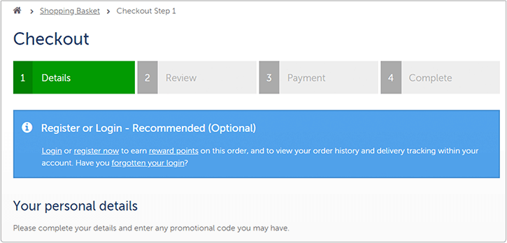
Guide customers through the checkout process by keeping them abreast of which stage they are at throughout it.This clarification is very helpful for them, and a smart business decision for you. Users will see which fields are necessary, and which are optional. In case they’ve skipped any necessary information, the system displays a gentle message alerting them to it. The checkout includes a “Terms and Conditions” section so customers can review them without leaving the page.
In the event that a customer hasn’t placed a big enough order for free delivery, they’ll get a notification at the checkout page: “Did you know? If you spend another £31.30, you can qualify for FREE delivery!” If customers have questions about delivery to their destination country, they can learn more in the delivery section, which contains information on special delivery conditions to every country.
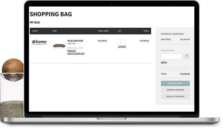
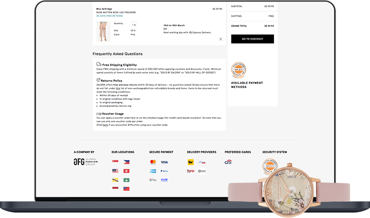
This store specializes in fashion, specifically: clothes, shoes, and accessories. Customers can find any products to their liking and desire. Whether it’s a mobile or desktop version of the website, you can enjoy optimized product data.
The shopping bag consists of not only the order and shipping & returns information, but also similar products and suggested products, enticing customers with a tease of “You may also love these…”. Additionally, we see the relevant trust badges in plain sight. By implementing them in this way, the store enhances its credibility to its customers. With one click on the Seal of Approval, customers can find the company’s contact information and its security status.
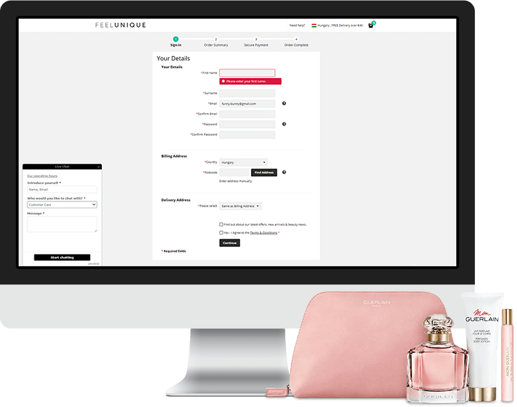
This checkout page is also pleasing to the eye. With its simple layout and light colors, users can easily concentrate on the checkout process completely. The site allows users to sign in with Facebook or just enter their e-mail. Nevertheless, keep in mind that having to sign in sometimes irritates customers. For this reason, unless you sell luxury goods (e.g. jewelry or automotive parts), we recommend implementing a guest checkout as well.
It is useful for customers if you provide suggested examples of the type of data they should enter. Doing so adds a touch of comfort and clarity, helping them to input everything correctly. Another benefit to include in your checkout design is to provide automatic information retention so your customers don’t lose the information they have already inserted.
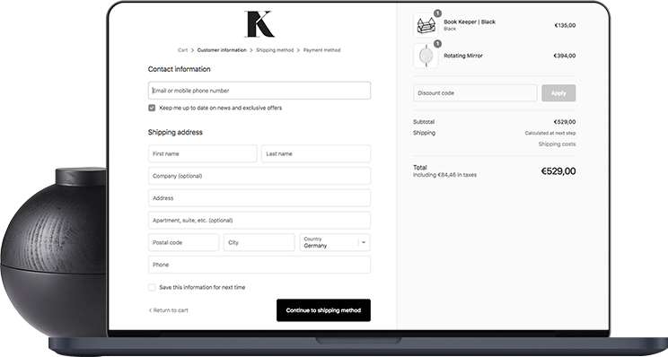
Whidegroup has extensive experience in optimizing the checkout process. Pointing to our ecommerce project for Norwegian furniture company, Kjellmann, we talk about improving customer experience through optimization of the buyer’s journey.
Our development team redesigned the website structure which allowed this online store to become simpler and user-friendly. After rebuilding the navigation, the customer journey was shortened. All improvement steps were made with an eye towards increasing the conversion rate at the checkout page.
Conveniently, you can add items to the shopping bag without being registered or signed up. If a user has doubts about their choice, they can edit item parameters, and then update the shopping cart without losing previous data.
After reviewing the summary and checking the order, customers easily make their way to a clutter-free checkout page. We have implemented a one-page checkout: the first step is for users to insert their information, the next step is review and payments. Here, customers can not only choose the most convenient payment method, but also get a last chance to edit their order.
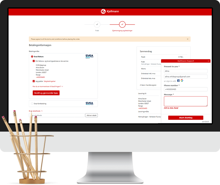
The system automatically counts taxes & shipping costs to the destination country. After filling in all the required information for delivery and payment, you are able to review the order and proceed with the payment. In case you need support, you can call or send an e-mail. Kjellmann’s customer service professionals will come to the rescue!
Let’s look at another client we assisted (client’s name is undisclosed due to privacy policy) – an online store that sells authentic, designer jewelry. Providing high-quality luxury products from many brands, the company is famous worldwide. One of our crucial tasks was the implementation of a secure checkout to build trust among customers.
Thanks to the displayed shopping cart, you see the order with shipping and total costs. After filling in all the necessary fields, you can check everything again and make payment. The inclusion of a discount code field is the icing on the cake. When a customer clicks the “Purchase” button, they go directly to the checkout page. This is especially advantageous for customers who know what they want and have no time to search the website.
The convenient checkout page design with its simple layout is user-friendly and allows customers to quickly make a safe purchase (thanks to both a secure connection and buyer protection). After all, when buying luxury jewelry, customers want their purchases to be protected. This understanding inspired us to add “BUYER PROTECTION GUARANTEED” right below the “Your Cart” block.
This particular online store provides several types of customer support. If customers need help, they can call the number which stands out at the header. Customers are also welcomed at Live Chat where an experienced assistant can help solve any problem.
The main goal of online stores should be to serve customers in the best way. When launching their own online project, every business owner wants not only to create a perfect first impression but to also leave a fine aftertaste. If you didn’t already, by now you understand that choosing to optimize your checkout process is a sure way to do so.
Above, we considered a list of the checkout page best practices and examples of top-notch online stores with an optimized checkout process. If you’ve decided to make a go of your business or want to improve your customers’ journey, we are here to help make everything possible. Drop us a line, today!

 Top 5 Funny Business Ideas That Turned Into Profitable Ecommerce Business


