Magento Store Redesign & UI/UX Improvement for the German Garden Plants Seller

Visit Website

320

hours of work

7

specialists involved

2.5

months of implementation

The Overview

Lichtnelke is an online store of the well-known perennial nursery in Germany. It is a family business which has been working since 1973 and is engaged in the cultivation and sale of enduring seedlings.
The Whidegroup team has been cooperating with the Lichtnelke company on a regular basis since 2020. We support the website in terms of regular Magento upgrades, performance optimization, and smaller tasks that arise. Since it is a seasonal business, the bigger part of customizations are implemented during the low-demand periods.
The latest task we worked on involved a Magento theme migration to Hyvä along with performance tuning. However, in this Magento store redesign case study we’d like to focus on how changing separate elements according to the best design practices affects the overall improvement of the website's UX and UI.

The Challenge

The client contacted Whidegroup team with the following requests:

  • Update the visual appearance of the site according to the latest design practices
  • Make website navigation more intuitive and improve customer engagement
  • Avoid making drastic changes to the website appearance to keep it familiar to regular customers

Therefore, we decided to start with a Magento store UI/UX audit to identify areas that need to be updated.

lichtnelke image lichtnelke image

The Solution

After conducting the comprehensive audit, the Whidegroup team implemented a series of design changes to modernize the site. All of the updates are aimed at improving customer interaction with the brand and increasing the conversion rate. At the same time, the targeted nature of the changes ensures that the site's appearance remains recognizable to regular visitors.

#1 The header’s redesign to improve user navigation

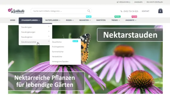
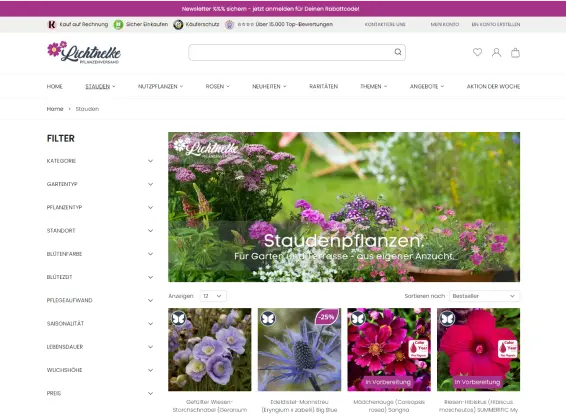
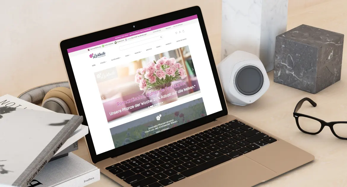
Before the redesign, the header lacked key icons such as the “Wishlist” and “User account login”. The overall look of the header and menu was visually outdated. In addition, the submenu, especially for categories with numerous subcategories, took up excessive screen space, making it difficult to explore product categories.

To address these issues, our Magento website redesign specialists implemented several key changes:

  • Icons: we added “Wishlist” and “User account login” icons, giving them a modernized look that aligns with established Magento UI design practices.
  • Menu: we refreshed the Menu appearance and added a scroll bar for easier navigation. The new scroll bar streamlined the open Menu, allowing customers to navigate more efficiently and improving the overall user experience.
Beforelichtnelke image
Afterlichtnelke image

#2 The home page redesign to increase user engagement

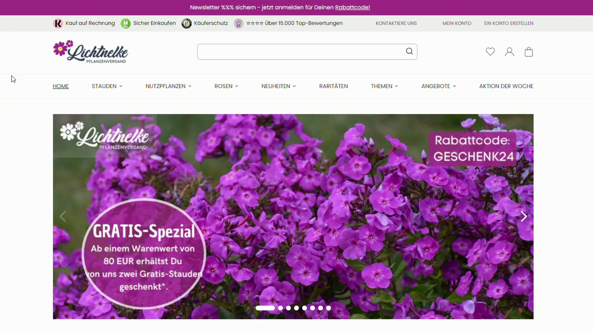
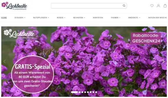
There were no interactive elements on the previous home page. Specifically, the static hero image failed to capture attention, product interactions were limited, and key promotional features were easy to overlook. The newsletter subscription was also buried in the footer, resulting in minimal sign-ups.

To enhance the home page experience, we implemented the following changes.

Changed the hero image

We replaced the static hero image with a dynamic carousel. The new images boost engagement by grabbing visitors’ attention and encouraging them to explore further.

Beforelichtnelke image
Afterlichtnelke image

Added hovers with the action buttons

We implemented custom hover effects on product thumbnail images, revealing "Add to cart" and "Wishlist" buttons. This allows customers to take desired actions without leaving their current page, improving the shopping experience.

Beforelichtnelke image
Afterlichtnelke image

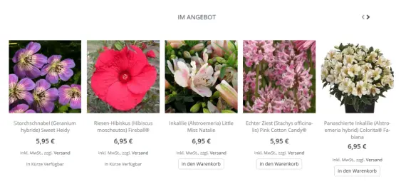
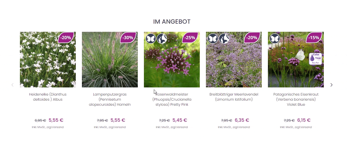
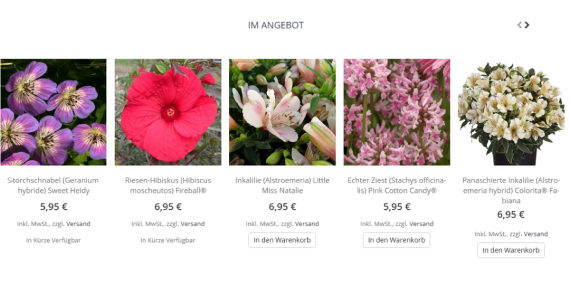
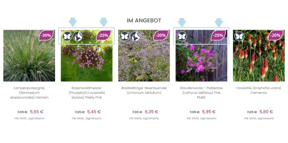
Implemented labels on thumbnail product images

We added labels that highlight key product features and promotional offers. These visual cues focus visitors' attention, encouraging faster decision-making and increasing the conversion rate.

Beforelichtnelke image
Afterlichtnelke image

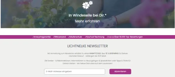
Created a separate block for the newsletter subscription

Previously, newsletter subscription was implemented as a tiny block in the footer. The new one definitely attracts more attention from users. This block motivates website visitors to subscribe to the newsletter and get a 10% off for their next purchase.

Beforelichtnelke image
Afterlichtnelke image

#3 Redesign of key elements on the product page to boost conversions

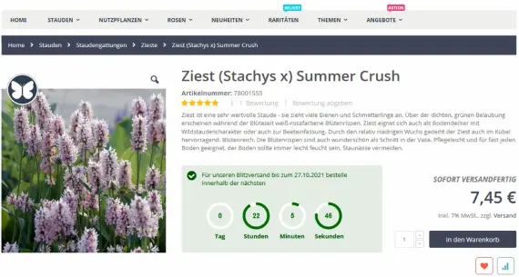
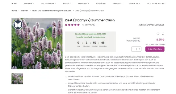
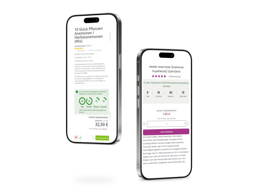
Before this Magento 2 site redesign project, key elements on the product page were not effectively positioned or visually prominent, leading to lower customer engagement. Important actions like adding items to the cart or selecting quantities were not as convenient and catchy as they should have been.

To address these issues, we refreshed and repositioned the following elements:

  • The “In den Warenkorb” (Add to cart) button: we updated the design and placement of the “Add to cart” button, making it more visible and easier for customers to click, which directly boosts conversion rates.
  • The quantity selection buttons: we redesigned and repositioned the quantity selection buttons to enhance their usability. This ensures that customers can easily adjust the quantity of items.
  • The delivery clock block: we raised and modernized the delivery clock block, making it more noticeable to customers. This block encourages visitors to place an order faster if they want to receive the delivery by a specified deadline.

These Magento store UI/UX improvements collectively enhanced the product page usability, resulting in higher conversions.

Beforelichtnelke image
Afterlichtnelke image
We have redesigned the mobile version of the website as well, to make the browsing experience more convenient. That is highly important for Lichtnelke as the majority of their website visitors come from mobile devices.
BEFOREAFTER
lichtnelke image

#4 The redesign of the category page for enhanced browsing experience

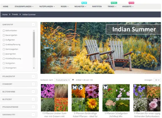
Previously the hero image, product photos, and filters were outdated, and key product details were not immediately visible.

So, we made a few UI/UX improvements to refresh the look of the store and align in with the latest design practices in ecommerce:

  • Updated the look of hero image and product photos: we added a more stylish hero image and made product photos more simple showing only one product. This led to better customer engagement.
  • Improved layered navigation style: we made the sidebar look clean without drastic changes to keep up with the current design trends.
  • Added new labels on thumbnail product images: we introduced new labels on product thumbnails, highlighting important product features and promotions. These labels help customers make quicker, more informed decisions.
Beforelichtnelke image
Afterlichtnelke image

The Result

The entire process of this Magento 2 site redesign case study took us about 320 hours of work.
We made a complete redesign of the home page, product, and category pages, and modernized the site's appearance without alienating existing customers.
Consequently, сustomer engagement increased as a direct result of UI/UX enhancements, contributing to higher customer satisfaction and increased conversions.
lichtnelke image
title
Henning Bargest Lichtnelke

Head of IT Department

“ Cooperating with the Whidegroup to redesign our website was a fantastic journey. Their specialists modernized the site's appearance without compromising our brand identity. So, our customers now enjoy a more engaging and up-to-date shopping experience. “

TELL US ABOUT YOUR PROJECT - WE’LL RESPOND WITHOUT DELAY!


    Scroll to top
    All rights reserved whidegroup.com © 2026 Privacy policy