Everything You Need to Know About
Ecommerce Homepage Best Practices to Maximize Conversions
 16 mins read

Everything You Need to Know About
Ecommerce Homepage Best Practices to Maximize Conversions
16 mins readAs visual creatures, we tend to judge a book by it’s cover. In ecommerce, your homepage is the book cover. Think of it as your virtual storefront. Since your ecommerce homepage is the first touchpoint many customers have with your brand, you have to make it engaging to draw customers into the store. If the front entrance isn’t attractive, would you go inside to explore the store? Many would say no. Regardless of how long your ecommerce business has been on the market, taking care of your user experience, the homepage UX, should be a top priority.
Getting consumers on your ecommerce homepage is half the battle. Ideally though, you want them to spend as little time as possible on your homepage. That might sound counterintuitive, but it’s true. The goal for any ecommerce website is to have customers off the homepage and explore the products so they can place an order. Unfortunately, reality isn’t so bright, as the average website bounce rate is around 47%. Bounce rate is the percentage of visitors that land on a website and leave right away without any interaction. You want to keep this number as low as possible. To help you improve your bounce rate and get more conversions, we’ve compiled a list of ecommerce homepage best practices. Keep reading to find out what they are!
A homepage is often the first place customers test how serious an ecommerce brand is about the mobile experience. If it loads slowly, feels cramped, or makes navigation hard on a small screen, strong visuals and good offers will not get much time to work.
Mobile traffic makes responsive design a baseline requirement. According to StatCounter, mobile devices accounted for 51.04% of global web traffic in May 2026, slightly ahead of desktop. So ecommerce homepage design should start with the phone screen and then scale up, not the other way around.
A strong mobile homepage gives shoppers a clear path without trying to show everything at once. Prioritize the following:
The goal is to decide what a mobile shopper needs first and make that path fast, readable, and easy to follow.
For example, Grovemade nails the desktop to mobile homepage relationship.
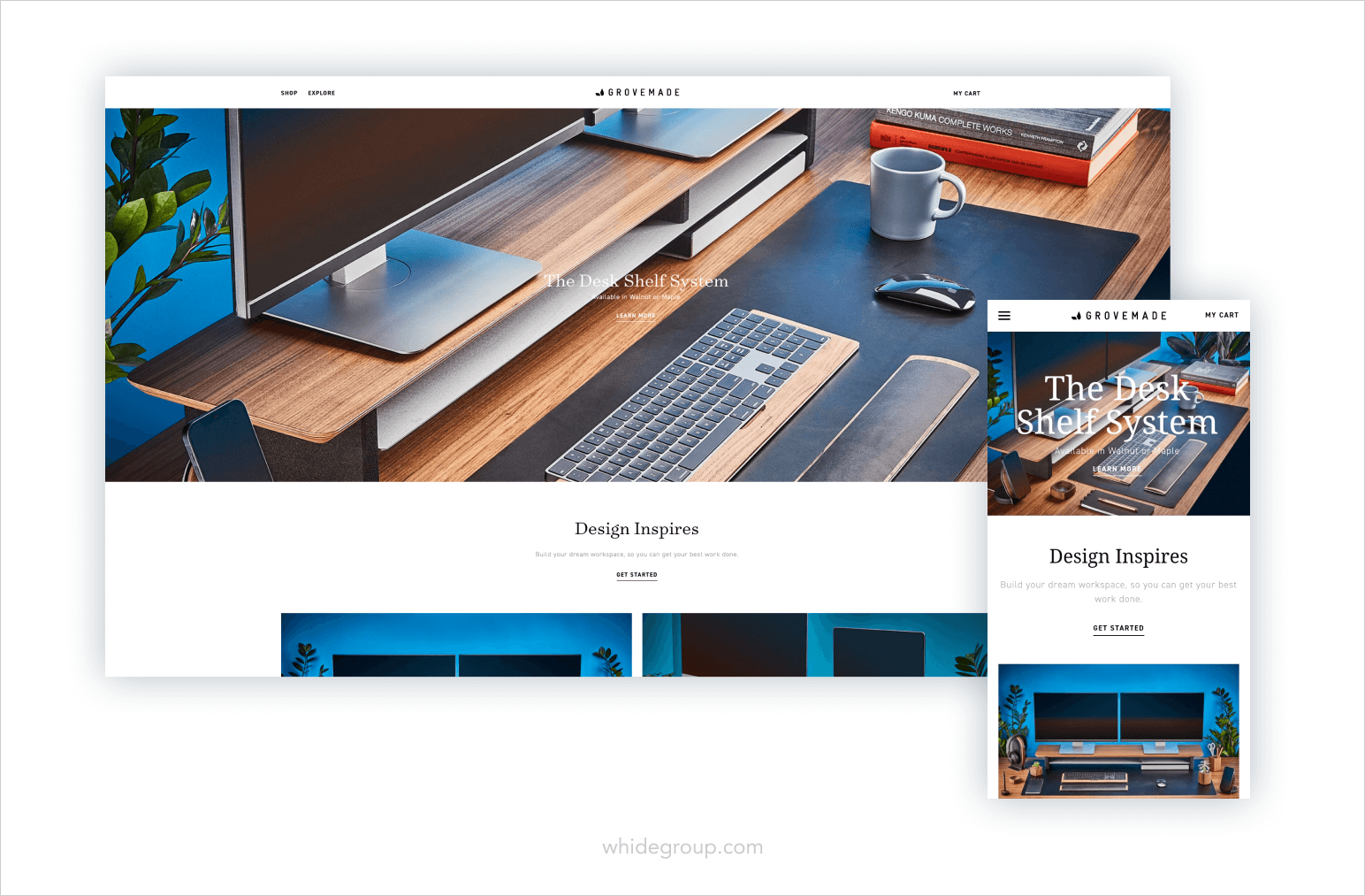
Every detail looks approximately the same with no aspect of the design sticking out like a sore thumb. The main information is laid out neatly and pleasantly which motivates the user to keep exploring the store.
Load speed is another thing to keep in mind when talking about mobile homepage responsiveness. An ideal website load speed shouldn’t be any longer than 3 seconds, otherwise you risk losing 53% of your mobile visitors. First step is to check your ecommerce homepage performance using Google’s PageSpeed Insights.
There are many ways to improve your ecommerce website performance, such as caching, image size optimization and more. However, some of them can require coding knowledge and if you lack the expertise, we suggest hiring a professional development team to help you out.
Above the fold refers to the top part (the first screen) of your webpage that’s visible without scrolling down. It’s the first impression a visitor gets not only about your ecommerce website, but about your brand in general. The Hero Banner of your ecommerce homepage design must strike a chord with your target audience. In the section below, we will focus on what ecommerce homepage best practices teach us about creating a design that will capture your visitors’ attention.
A hero banner is the most visible area of your homepage located at the top. Upon landing on your homepage, the shopper must realize one thing – you’re an ecommerce business and you have products to sell.
Your hero banner can be anything you want:
The possibilities for crafting a main content banner are endless, but the end goal is to establish your distinct brand look.
You want your hero banner to grab the customers attention with professional and sleek photography or videography, a catchy unique value proposition (we’ll discuss in the next paragraph), and a call to action or CTA. Most ecommerce homepage banners are clickable and lead to product categories or product pages.
Usually, hero banners are product pictures, either staged or lifestyle shots, to communicate to visitors what you sell right away. Take a look at Neuro’s homepage.

By displaying their products in a minimalistic, but colorful photography, you can immediately tell what purpose their brand carries. A simple call-to-action (CTA) stands out against the color palette of the homepage, directing the visitor to a product catalog. They also ensure their hero banner looks great and works well on mobile.
Make sure to include a CTA button on your hero banner to navigate the newly landed visitor further into your store. There’s no need to get creative over CTA wording, as you might confuse the reader with unfamiliar navigation. A simple “Shop” or “Discover” will suffice. When deciding on your ecommerce homepage color palette, consider using a contrasting shade for your CTAs that are still complementary to the color scheme to make them impossible to miss.
Another example of a good homepage hero banner is Tinker Watches.
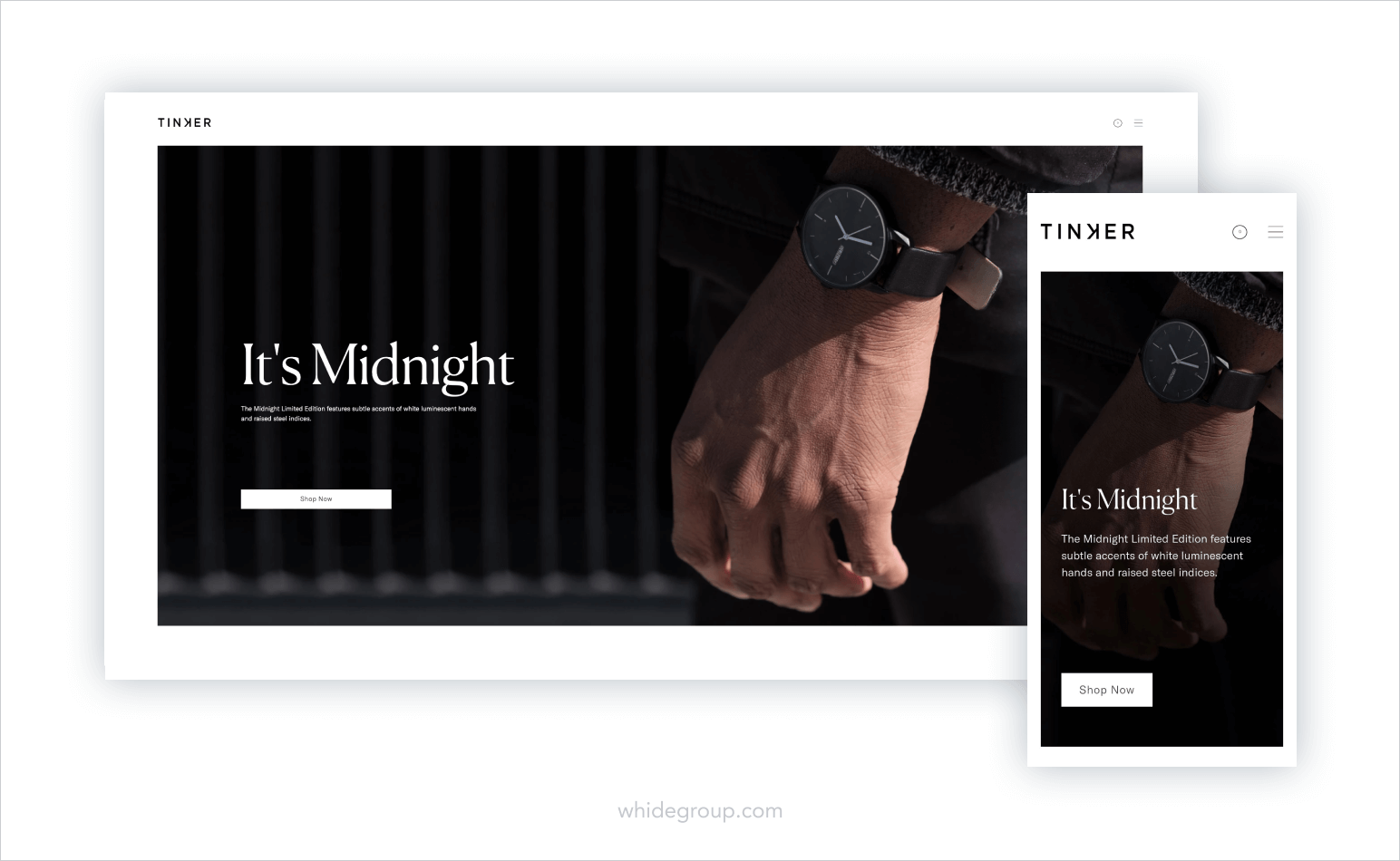
They opted for a muted design to complement their business image. The homepage features their limited edition watch with a call-to-action that takes you straight to a product page. There is no doubt that such an alluring storefront is going to draw customers further into their website.
Now that you have a general idea what to do about a hero banner, the next step in designing your ecommerce homepage is putting together your unique value proposition (UVP). UVP is a statement that describes to consumers the benefits of your offer and what differentiates you from your competitors. Your unique value proposition should address your customer’s problems or desires and provide a solution in a clear and concise way.
Ratio’s ecommerce homepage does a good job with their UVP.
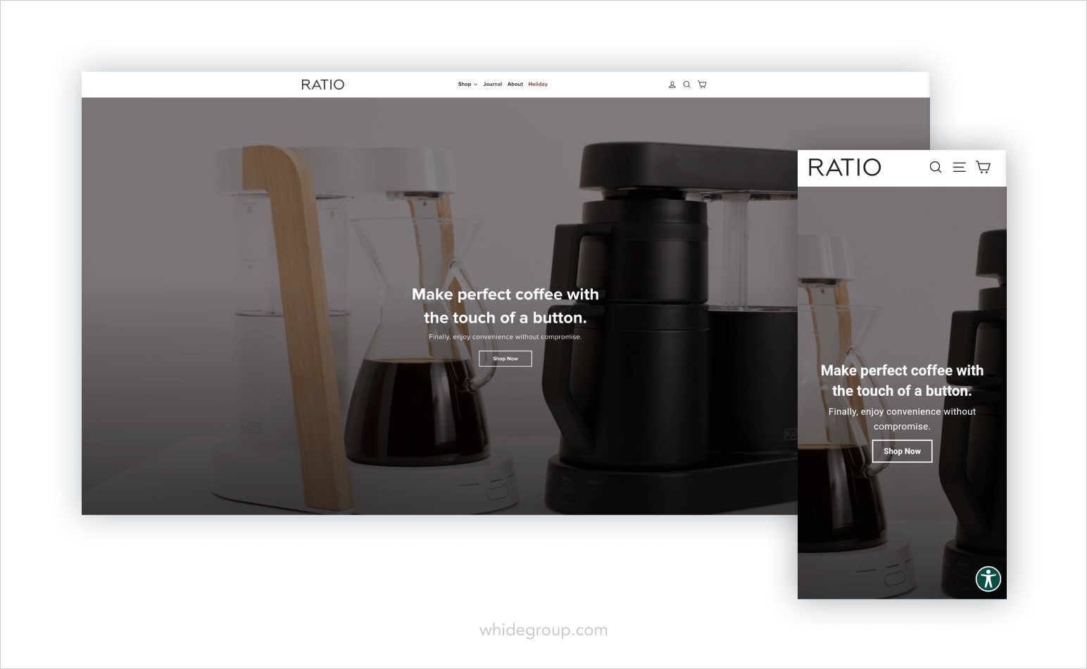
Let’s break down what makes their UVP good:
Creating the right unique value proposition for your brand can be challenging. You might need to conduct several A/B tests before you come up with a feasible UVP. One important thing to keep in mind is that your value proposition is not your slogan or a catchphrase. Instead, it’s a way to communicate the value you bring to your consumers.
There is no need for a full-fledged speech on your ecommerce homepage. A simple statement, like that of Fosfo, can be all you need.
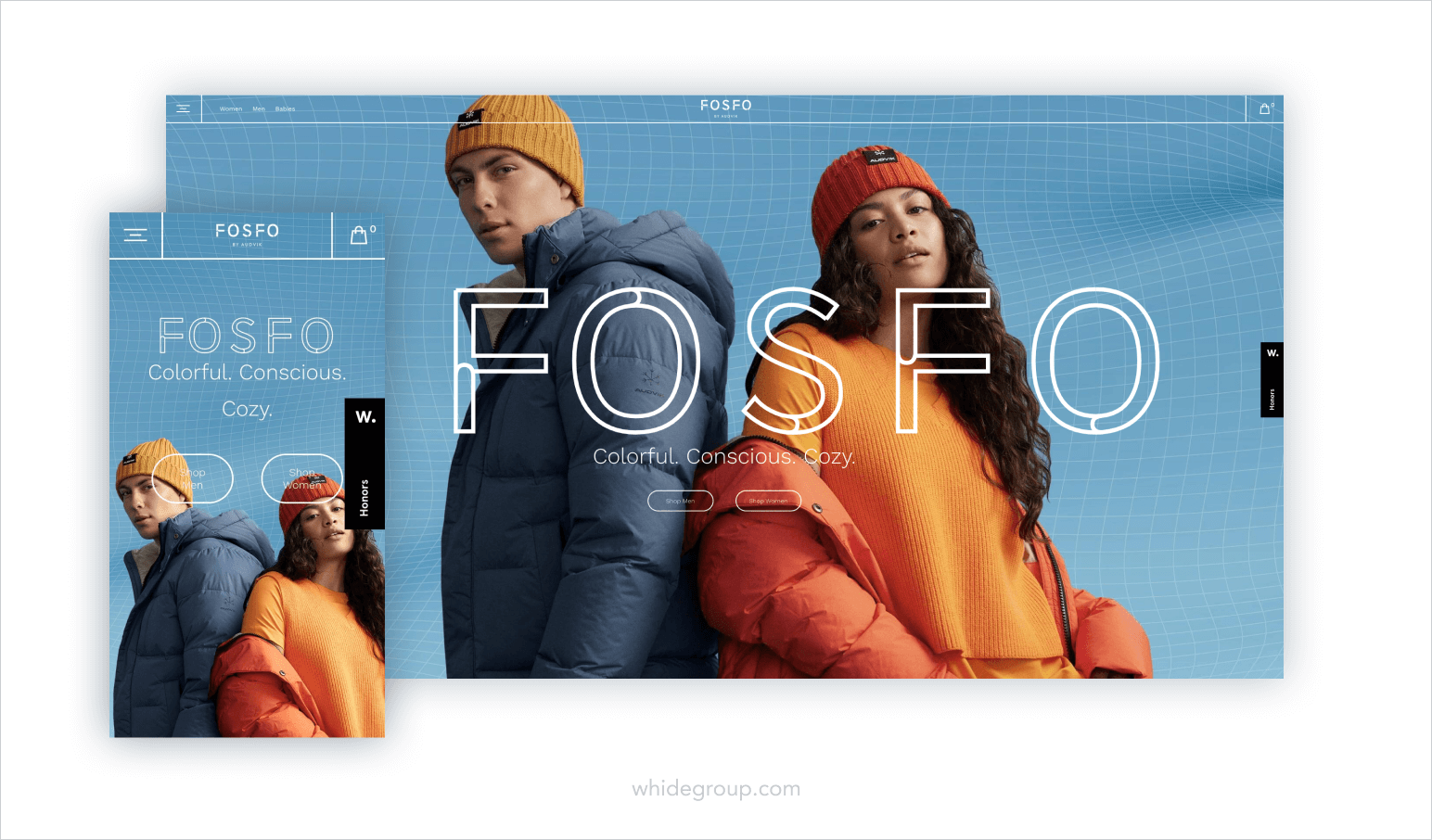
Their UVP is straight to the point and affirms shoppers that their apparel is environment-friendly, cozy and vibrant. What else would you want from winter wear?

A customer landed on your ecommerce homepage and you’ve managed to captivate their attention with a polished hero banner and concise UVP. Now they’re ready to check out your products. This is where website navigation comes into play.
Your homepage header layout must be intuitively understandable from a first glance. The last thing you want is customers stumbling around your homepage in search of where to go next and eventually hitting the “go back” button. Ideally, you want to have a “sticky” menu, meaning the navigation menu is fixed and remains visible no matter how far down the visitor scrolls.
Your category navigation menu can be placed on the left hand side of your homepage or as a horizontal navigation bar above the hero banner. If you sell multiple types of products, keep the amount of visible categories to a minimum. To maintain a clean and easily scannable look, allow your categories to expand in a drop-down menu, revealing subcategories.
Either way you choose, you have to consider how your navigation menu will be displayed on mobile. Typically, mobile navigation is presented in a “hamburger” style menu – the three horizontal lines you see on the best mobile homepages that open a side menu.
To help you visualize, take a look at Lush.
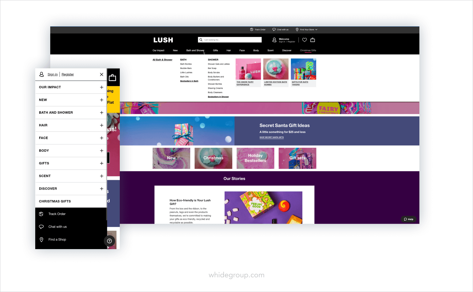
There are nine categories, all of which expand to show a multitude of subcategories to choose from. A corresponding hamburger menu is present on a mobile version. With this approach, their ecommerce homepage maintains a refined look and doesn’t compromise ease of navigation.
If you’re a smaller business and don’t offer a huge inventory, consider adding product pictures into your subcategory menu. This helps shoppers visualize what they will find upon clicking each category.
Sierra Designs hits the nail on the head with their subcategory menu imagery on desktop.
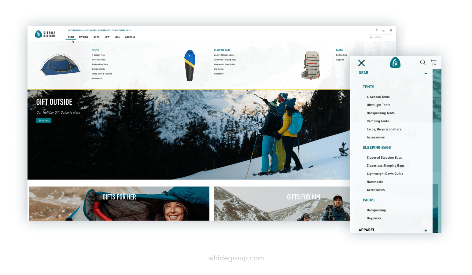
Notice they chose to opt out of product images in the mobile category menu to optimize performance. Using a single product category image clearly illustrates what the section holds and guides customers to the area they want. This option is particularly useful if you offer technical items or group your products into detailed categories.
When talking about ecommerce homepage best practices, we can’t overlook the importance of a proper search bar.
These are highly motivated customers who know exactly what they’re looking for on your ecommerce homepage. Your search bar should be clearly visible and always available in the user’s viewport, no matter which page they go to on your website. Don’t forget to create a responsive search bar on mobile. Make sure the search query input is frictionless and the search button is easy to click.
Consider implementing an autocomplete feature for your search using additional third-party plugins and extensions, such as Horsey, MagicSuggest or EasyAutocomplete. This will help determined visitors and visitors who aren’t completely sure what they’re looking for to easily find specific products.
100% Pure is a best-in-class example of an excellent search tool.
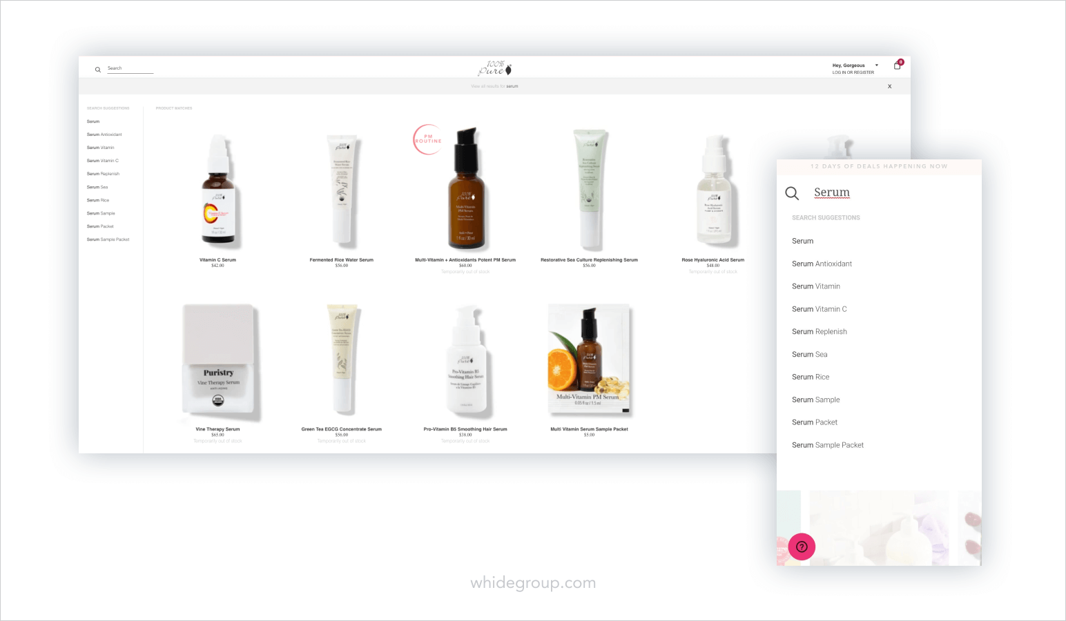
When a user types a search query into the search box, they are presented with autocomplete product options without leaving the homepage. A list of suggestions on the left hand side proposes options for the query and takes the user straight to a results page. Offering an autocomplete search box provides potential customers with the best shopping experience and decreases the chance they’ll leave the store empty-handed.
A complicated visual for your search box isn’t necessary. The standard “Search” option and a magnifying glass icon is all you need. Your goal is to take your customers on a journey across your ecommerce store, not leave them confused.
After completing the above steps, there is still space in your header to input additional information without the worry of overcrowding. Think about what your customers would like to know about your brand and which links they would need quick access to. Each ecommerce website homepage includes different resource links in their headers. These could be:
The options are nearly limitless. But don’t go and put each and every link into your header. There is no way an overcrowded header looks good. Take a look at your ecommerce website statistics, using the right analytics tools, or conduct A/B testing to find out where your customers commonly go across your website and provide links to those pages.
Knotty Tie goes against expectation by placing all of their relevant information under an Info menu.
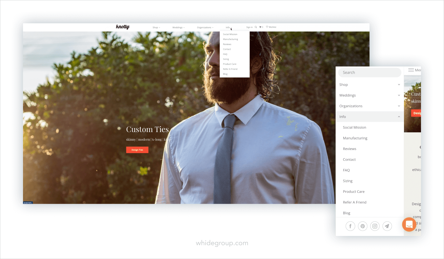
This works well because it saves space on their header, in the mobile menu, and lays out important information in one place. The customers won’t need to wander around their homepage to find the links they’re looking for.
Don’t forget to put sign in & sign up buttons and the shopping cart icon in the header. Generally, positioning such shopping tools in the top right corner is seen in most ecommerce homepage best practices.
Nobody likes pop-ups, they’re annoying and distracting. But only if they’re done wrong. Statistics tell us that well-crafted and purposeful pop-ups work, since the average conversion rate for a pop-up is 3.09%. There is a whole science behind successful pop-ups, so we’ll try to cover just the basics below.
Pop-ups can hold different types of content, from promotional offers to newsletter subscriptions. However, the end goal for most pop-ups is to collect the visitor’s email address. This can be done through various pop-up types:
First and foremost, don’t make your pop-ups appear immediately! Imagine you went to a brick-and-mortar store and the consultant starts harassing you about their special offer as soon as you enter. Would you be inclined to explore the store? Probably not.
Let your visitors look around your ecommerce homepage for a bit before your pop-up appears. Research shows that pop-ups that emerge at the eight second mark have the highest conversion rate, then those that appear earlier or later.
Be clear about the value proposition of your pop-up. If you’re offering a discount for signing up to a newsletter, make it evident. Avoid using vague phrases, like “Sign up to receive goods”. Your visitor will have no idea what the “goods” you’re offering are.
John Paul Mitchell Systems makes the value of their offer undeniable.
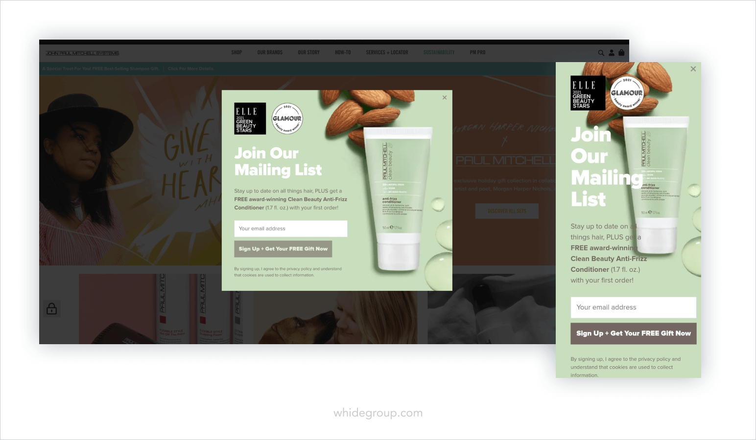
The intent of their pop-up is transparent – they want you to join their mailing list. However, what keeps the potential customer engaged and stops them from leaving the store is the proposition of a free product. If the visitor signs up, they will receive a gift with their first order. In the eyes of a customer, giving away their email address for a tangible gift is an easy decision to make.
Another thing to notice is the inclusion of product imagery. Pop-ups with pictures tend to perform better. Since humans are visual creatures, we tend to linger on images, rather than on plain text.
Slate does a good job integrating images into their pop-ups.
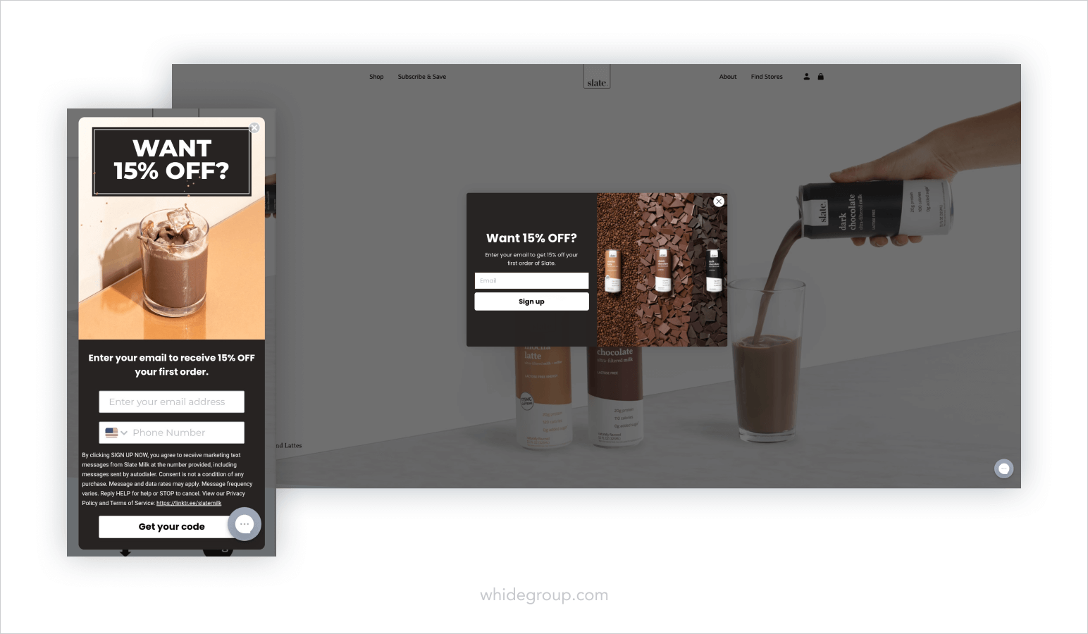
The imagery is so delicious, you might just want to sign up. Moreover, Slate uses exit intent pop-ups to avoid disturbing the customer until the moment they decide to leave.
Keeping mobile homepage UX in mind when designing your pop-ups is also a must. If your pop-up has a lot of copy, optimize it for mobile screens for better readability. Make sure your input fields are all responsive and frictionless.
Additionally, set up the frequency at which your pop-ups will appear to the same user. If the visitor has cleared away your pop-up, make sure it doesn’t appear again for several hours or even days. Respect your customer’s “No” and allow them to traverse your website on their own terms. The same goes for your subscription pop-ups. You wouldn’t want to ask your consumer to subscribe if they’re already a part of your mailing list.
And above all, be very mindful when deciding to implement pop-ups into your ecommerce homepage. A poorly constructed pop-up strategy can be detrimental to your website’s UX. Aim to create pop-ups that bring value to your customers in the right place and at the right time.
Now that the main part of your homepage is out of the way, it’s time to start crafting your homepage below the fold. Below the fold refers to the part of your ecommerce homepage that’s only visible after scrolling down. You can place additional information about your brand, feature your products, provide social proof or leave social media links in this section. Below, we will take a closer look at ecommerce homepage best practices of creating a below-the-fold section that helps your store create sales.
Once you’ve enticed website visitors with your above the fold presentation, you can further engage them by featuring products on your ecommerce homepage. These could be your:
Your goal is to show your products from the most attractive point of view and motivate your website visitors to fully check out the product catalog. Placing a featured products section across the entire screen is within ecommerce homepage best practices. This ensures that visitors focus their attention solely on your products.
No matter which products you choose to feature, you must have a comprehensive understanding of why you want to show customers the chosen items on your ecommerce homepage. Are you demonstrating bestsellers so the new visitors will see the value of your offer? Do you feature new arrivals to promote fresh items to your loyal customers?
Take a look at how Krave Jerky showcases their products.

The next thing you see after scrolling down the Krave Jerky website is the Meet the Lineup section which takes up the entire screen. Since their product variety is narrow, one product carousel divided into four subcategories is more than enough for the homepage. It makes the browsing experience effortless and provides a complete understanding of the products offered.
If your website has a more complex catalog structure, then your ecommerce homepage layout should display multiple product categories to advance your customer experience. For example, Allbirds has several featured products. Showing this to their potential customers right away shortens the buyer’s journey and leads to higher conversions.
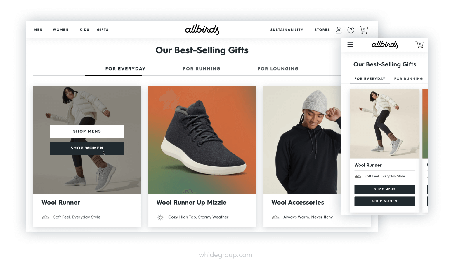
The first section below the fold is their bestsellers. Each banner offers an alternative to shop for men or women and leads to a product page with a prominent call-to-action.
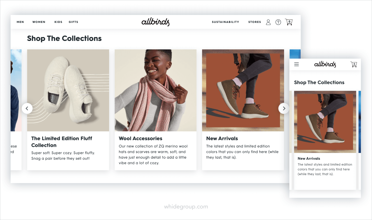
As you scroll down, you meet their collections carousel. These are more broad product categories, such as apparel for kids, limited edition collections, new arrivals and so on. It allows customers who are not sure what they are looking for to begin their shopping journey right from the homepage.
Social proof is a psychological notion that essentially means people tend to copy behavior of others in unfamiliar situations. In marketing, this means providing evidence that other people have purchased from a certain brand and found merit in their product. Ecommerce homepage best practices teach us that providing social proof in the form of customer testimonials or reviews is necessary. How can your brand start building trust with new customers if you can’t guarantee your reliability?
Statistics show that 79% of consumers trust online reviews as much as personal recommendations.
A customer testimonial is a quote from a delighted client that demonstrates the value of the purchased item. Gather testimonials from previous customers and display them on your ecommerce homepage. To give you a better perspective, take a look at The Letter J Supply.
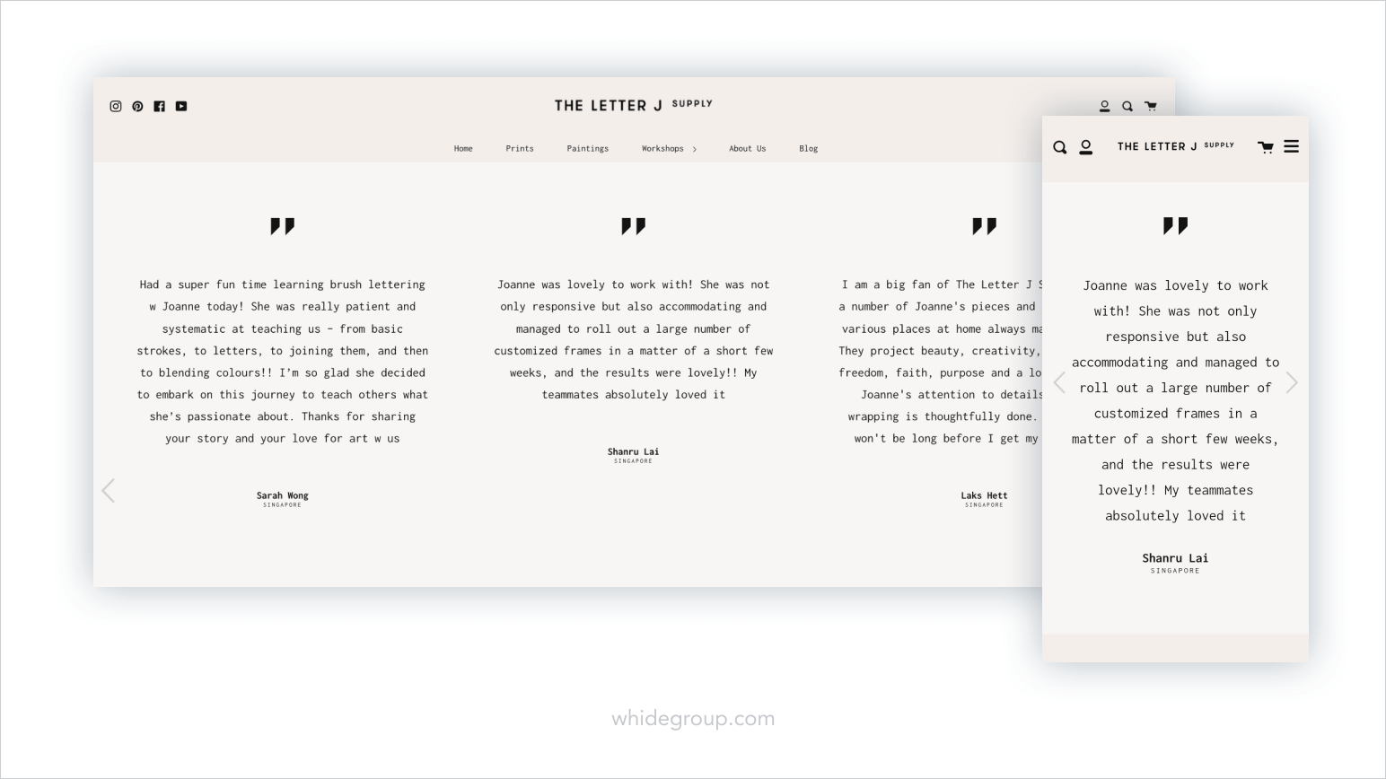
Their numerous customer testimonials are showcased as a carousel which takes up the entire screen. Upon landing on their homepage, the customer won’t need to do much scrolling to find social approval. This is where The Letter J Supply starts building trust between customers and their brand.
If you choose a humorous brand voice to speak with your customers, sprinkle some creativity that would resonate with your target audience. We just couldn’t pass by this example from Made by Nacho.
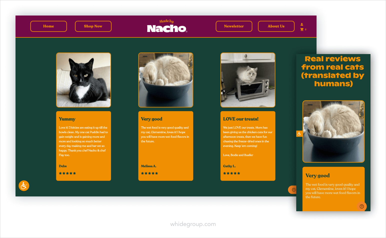
Their review panel alone is enough to strike a chord with their audience and claim a spot in the shopper’s memory. Sometimes, that’s all it takes to persuade consumers to place an order in your store.
User generated content can be any form of content published by customers on their social media platforms. This can be photos, videos, or text featuring the product they have bought from a certain brand. Incorporating user generated content into your ecommerce homepage can raise consumer trust and produce more conversions.
According to statistics, 62% of consumers are more likely to buy a product if they were able to view customer photos and videos.
NYX Cosmetics is the perfect example.
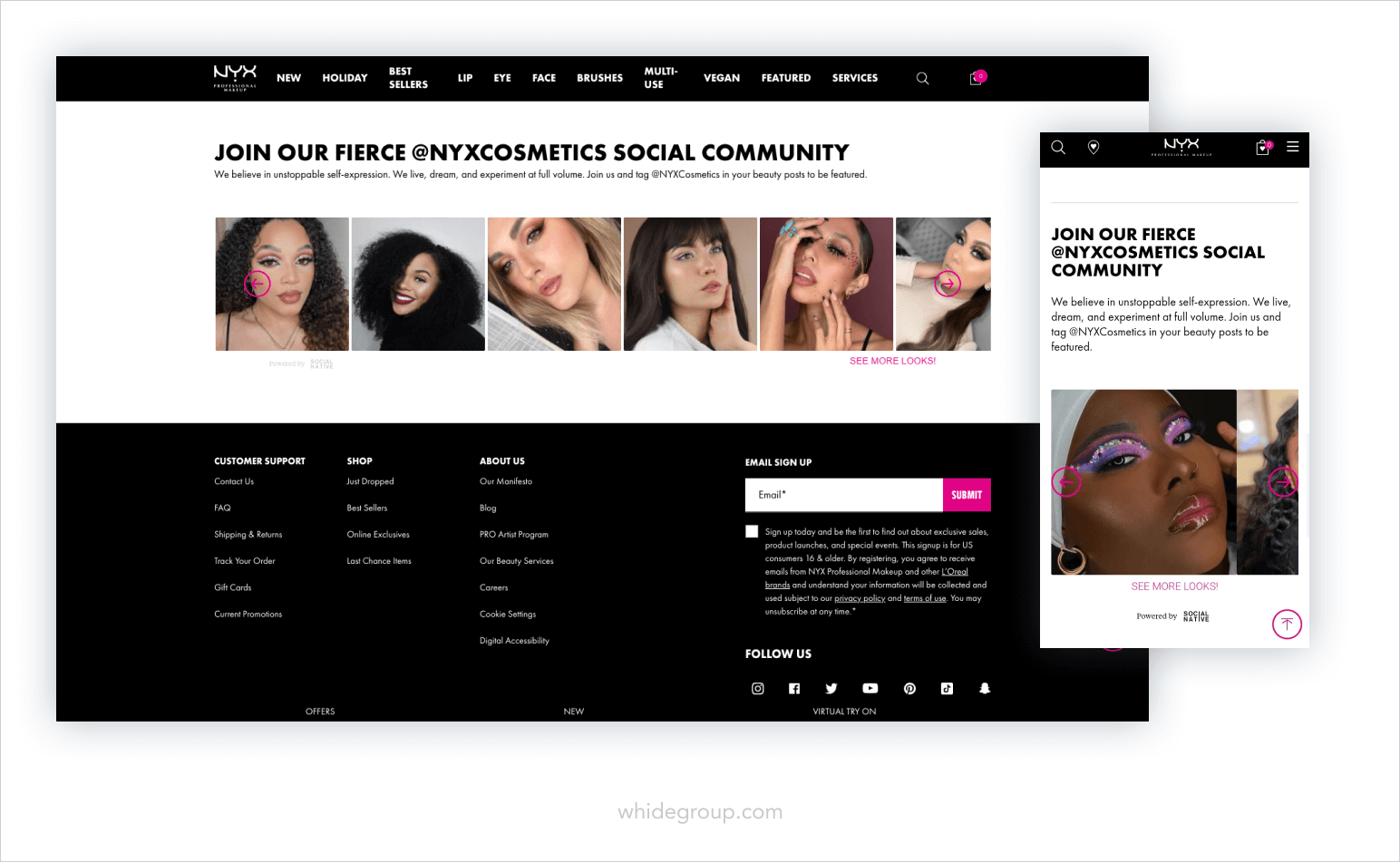
The brand encourages satisfied customers to join their social community by tagging NYX Cosmetics in their social media posts. It’s a fair trade-off, since customers then have a chance to be featured on their favorite brand’s homepage and the brand gets to showcase social approval on their storefront.
You shouldn’t stop at customer testimonials and user generated content. If magazines and news outlets have written about your brand, be sure to tell the world about it! Check out Molekule’s ecommerce homepage.
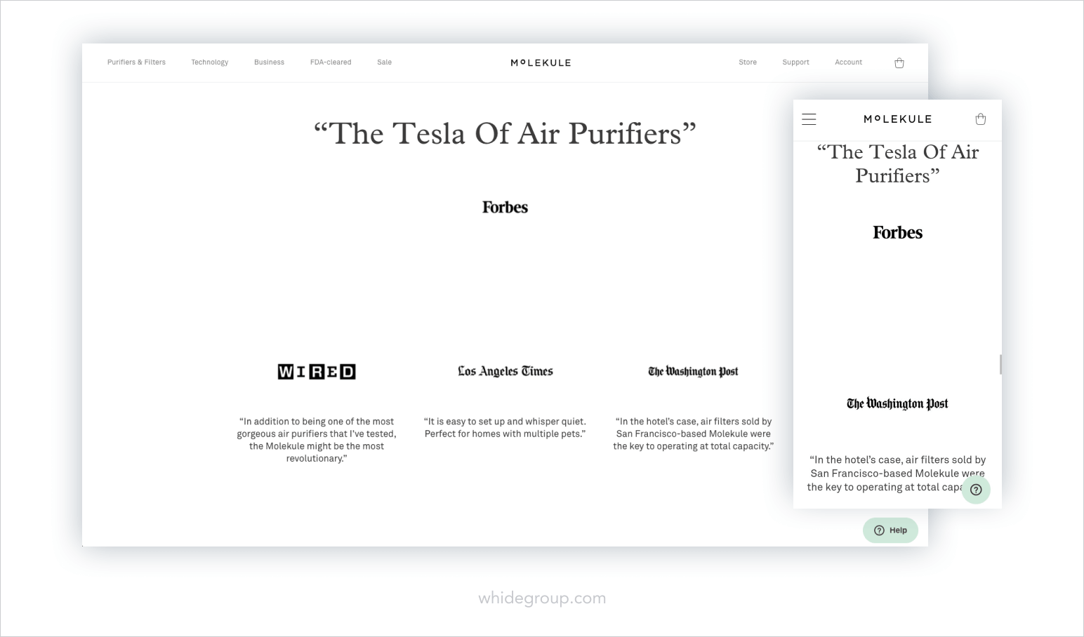
Molekule proudly presents highlights from the articles posted in the renowned magazines that have written about them. Undoubtedly, the customers who land on their homepage are going to rely on these testimonials when deciding on a purchase. Although the use of whitespace is a bit excessive, quotes from the article certainly depict what should be on a homepage.
Closing out the topic of ecommerce homepage best practices, let’s discuss what additional information can be placed in the footer. Since most visitors aren’t going to scroll all the way to the end of your homepage, you get to have a little more creative freedom. If you’ve ever seen ecommerce website footers, then you know how different they can be.
As a rule of thumb, what should be in your footer is what’s missing from your header. For instance:
Upon reviewing a myriad of ecommerce website homepages, we found that most websites put some sort of a parting content block just before the footer. In particular, Mollyjogger stood out with their design.
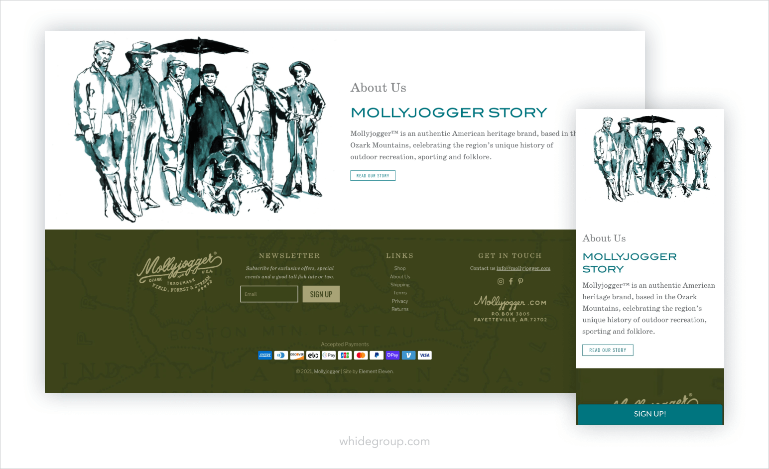
Their website design is visually pleasant with a dash of vintage aesthetics carefully intertwined into their ecommerce homepage. That’s why their About Us banner right above the footer exquisitely fits the brand’s overall look.
Another alternative that frequently appears at the bottom of many website homepages is a social media feed. Since social media has become integral in our lives, enticing shoppers to follow your branded social profile is a part of ecommerce homepage best practices.
Take Maapilim for example.
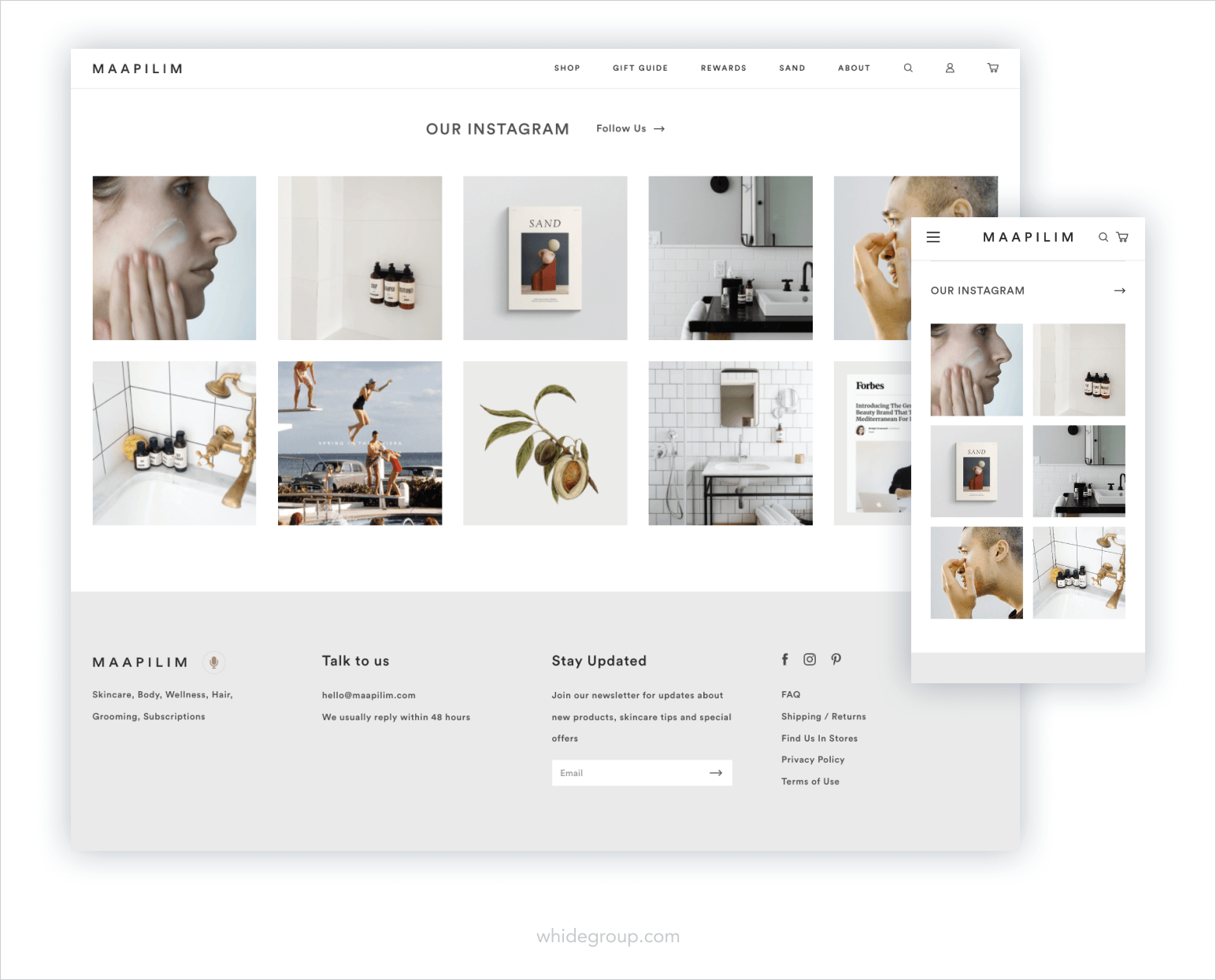
The Instagram feed at the bottom of the page complements the overall sophisticated style of Maapilim’s brand. It virtually invites visitors to check out their social media for more inspiration. You can’t go wrong with a clean and minimalistic look like this ecommerce homepage.
Homepage design for an ecommerce store is a tricky topic. With considerable competition on the market, it can be tough for your homepage to stand out against a crowd. In this article, we’ve reviewed some of the ecommerce homepage best practices to pick and choose from when creating your website’s homepage.
The takeaway is straightforward – your ecommerce homepage must reflect your business image and effectively convey it to your customers. As your virtual storefront, it should communicate the purpose your brand carries, clearly depict what products you sell and why buying from you is more advantageous than from your competitors.
Choosing a proper design is also essential, regardless if you go for a colorful and bold palette or decide on soft and neutral tones. You’ve got limited time to captivate your website visitor’s attention, so make every detail count. The Whidegroup team is ready to help you build an exceptional homepage from the ground up or refresh an existing one. Feel free to contact us anytime for the custom homepage you desire!

 How to Reduce Bounce Rate: Shopify-Specific Aspects to Fix


Up to 30% of visitors will use the search bar when provided with one.