Website Accessibility Standards:
How to Make a Website More Accessible and User-Friendly to People with Disabilities
Website Accessibility Standards:
How to Make a Website More Accessible and User-Friendly to People with Disabilities
Share post
The power of the Web is in its universality. Access by everyone regardless of disability is an essential aspect. Tim Berners-Lee, W3C Director and inventor of the World Wide Web
Table of Contents
ToggleCurrently, the web usability definition reads as follows: the inclusive practice of ensuring there are no barriers that prevent interaction with, or access to, websites on the World Wide Web by people with physical disabilities, situational disabilities, and socio-economic restrictions on bandwidth and speed.
For catering to all categories of users with equal opportunities for web browsing, the World Wide Web Consortium (W3C), represents Web Content Accessibility Guidelines (WCAG), which contain clear instructions on how to make a website browsable and provide website accessibility for disables users. The first version was released in 1999, then WCAG 2.0 in 2008. Since 2018, the most current version is WCAG 2.1. Web Consortium also announced the release of WCAG 3.0 in late 2022.
Currently, there are two main reasons that make business owners search for the answer to the question “how to make a website more accessible for the disabled”. The first one is the desire for providing equal opportunities for browsing for all the categories of users, whatever limitation they may have.
The second factor inspiring business owners in making digital content accessible is a legal one. So, why is accessibility important from a legal standpoint? Depending on jurisdiction, the reality is that many websites put themselves at risk to be sued for not providing their users with an accessible interface.
The legal world can already illustrate such examples as the case of Domino’s – the multinational pizza restaurant chain that prides itself on providing an exceptional customer experience. In October 2016, legally blind man Guillermo Robles, filed a lawsuit claiming that Domino’s website was not accessible via screen reader, and he was unable to order a pizza this way.
Guillermo Robles won the trial at the 9th Circuit Court of Appeals. The US Supreme Court then declined to hear a further appeal after the pizza magnate sought to have the decision overturned. The court essentially held that from this point forward, websites should be treated as places of public accommodation, and thus they should provide equal opportunities for browsing to all categories of users with diverse abilities. This decision essentially opens the door for more lawsuits and higher expectations for mobile and website accessibility. And now, Domino’s can say a lot on how to make a website blind-accessible on the basis of their own experience.
The answer to the question “how do I make my website accessible?” should start from learning the basics of the website accessibility guidelines. Actual web accessibility guidelines consist of three levels of web content accessibility:
Each of the WCAG compliance levels consists of three components that work together. These components are:
In this article, we focus on considering Web Content Accessibility Guidelines. WCAG accessibility relies on four main principles of information provided, that are abbreviated as POUR – Perceivable, Operable, Understandable and Robust. Keep reading and discover the actual WCAG 2.1 checklist below!
The first component of web accessibility guidelines is the perceivability principle. So, let’s look at how to make your website more accessible in terms of the perceivability principle. First and foremost you must ensure that both the information and user interface components are presented to users in ways they can perceive. This means that any user must be able to receive and process the information being presented with at least one of the senses. Currently there are two main approaches to gain perceivability – text alternatives and captions usage.
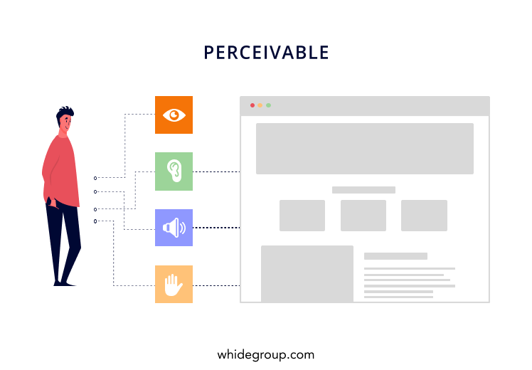
Text is a real savior when it comes to representing non-text content. Below are examples of how you can use text to represent non-text information:
People who are hearing or visually impaired can’t hear audio or see video. Consequently, they need some alternatives to receive the information. Such alternatives can be the following:
You should also take into account that well-written text transcripts containing the correct sequence of any auditory or visual information will provide a basic level of accessibility and facilitate the production of captions and audio descriptions.
The operability aspect states that user interface components and navigation must be operable. Put simply, users must be able to operate the interface and the interface cannot require interaction that a user cannot perform.
Being operable for content means providing such components as keyboard accessibility, sufficient time, navigation, and input modalities.
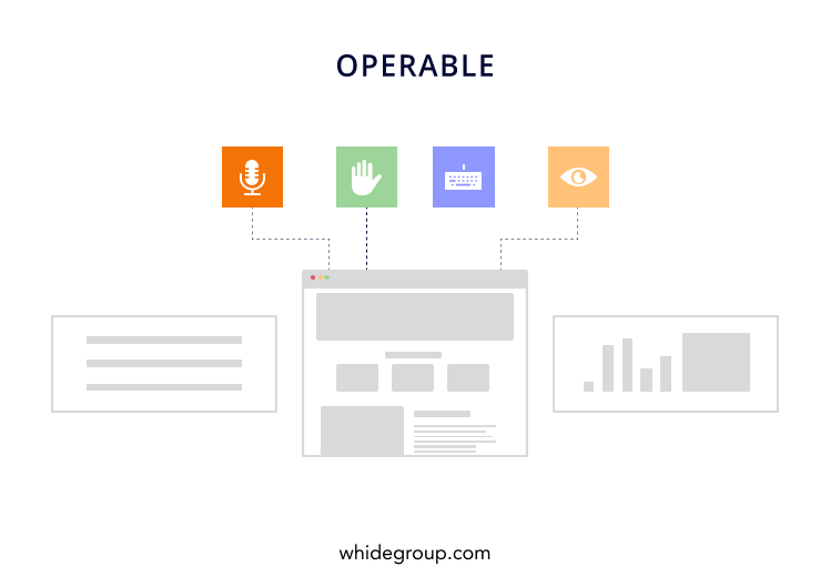
Some people do not use a mouse. Instead, they rely on the keyboard to interact with the web. This approach requires fully-fledged keyboard access to all functionality, including form controls, input, and other user interface components.
Keyboard accessibility requirements include:
Some categories of people need more time than others to read the content and interact with it. For instance, such actions as typing text, understanding instructions, operating control elements or completing tasks on a website may be time-consuming.
To provide the users with sufficient time for fully-fledged interaction with your website, we recommend that you consider the following measures:
Ensuring web content is well-organized is an important step since it guides users through the website and helps them to orient themselves and navigate effectively. The following steps will help you make your website navigable to ita users:
One more idea you can consult to answer the question of how to make your website accessible is addressing input modalities. The introduction of input modalities beyond the keyboard is vital when it comes to providing web content accessibility. Such input modalities can be represented as touch activation, voice recognition (or speech input), and gestures. Yet, not everyone can use each of these input modalities, nor to the same degree. Particular design considerations can maximize the benefit of these input modalities and increase accessibility compliance for the websites. Here are few examples:
Being understable for website content means that any user must be able to understand all the information provided along with the user interface. So, what makes a website accessible in terms of understandability? The main ways for obtaining understandable website content are following the principles of readability, predictability and input assistance.
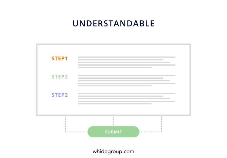
When working on creating accessible websites, content writers must ensure that every piece of the text content is readable and understandable enough to the broadest audience possible, as is implemented in the best ecommerce blogs. Cases when the text content is read aloud by text-to-speech should also be taken into account. You can reach it by the following ways:
Many people get disoriented or distracted by the inconsistent appearance or behavior of web content. To prevent this, you must follow the principle of predictability, which states the following:
Some interactions on the website can be particularly confusing to users. One such monster for people can be simply filling out inputs – many people claim they experience difficulties with it, and that results in them inadvertently making mistakes. Here are the ways you can help your users prevent, avoid, or correct such mistakes:
The fourth and the last principle of WCAG guidelines is robustness. According to this principle of accessibility requirements for the websites, you should strive for making content robust enough so that it can be interpreted properly by a wide range of user agents, including assistive technologies. One more requirement here is that users must be able to access the content along with the development of technologies, which means the content must remain accessible in concert with evolving technologies and user agents.
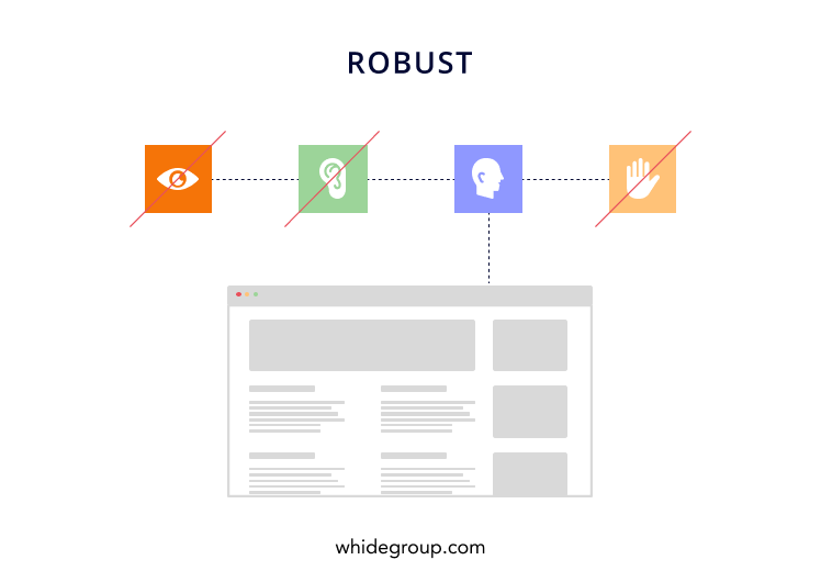
The only component for the robust principle is compatibility, which states that content should be compatible with different browsers and assistive technologies, as well as with other user agents. This can be achieved via the following measures:
To ensure that everything is fine with your website in terms of accessibility, the best option is implementing one of the widely-available tools that can assist here. The best of them can help you with testing your website, as well as delivering clear and understandable recommendations not just on how to make a website accessible for the disabled, but how to do so and make it even better than ever for abled users, too.
Currently, you can find plenty of tools and automatic checkers to verify the accessibility of your website. Among the most popular of them, we distinguish the following:
The most popular accessibility checker to date, WAVE is available both online and as a Firefox add-on. Developed by WebAIM, an organization devoted to making web content accessible to people with disabilities, WAVE gives clear recommendations about how to enhance particular page’s accessibility and provides a comprehensive understanding of how to make your website ADA compliant.

In case you need an automated solution to assure ADA compliance retail stores, you may find it interesting to use WAVE API on a paid basis. It’s beloved by many business owners and web developers for its usability, insightfulness, and almost endless opportunities for customizing reports.
AChecker (or Accessibility Checker), is an open-source tool to help you obtain a clear impression about your website accessibility. Developed by the Inclusive Design Research Centre (formerly known as the Adaptive Technology Resource Centre) of the University of Toronto in 2005, this tool remains one of the most popular when it comes to answering the question of how to make your website handicap accessible.

Depending on your role: public user, registered user, administrator or developer – AChecker offers different sets of features. To get all the benefits of the AChecker accessibility tool, you must register an account at an official AChecker website. By doing so, you’ll get access to enhanced features such as saving your reports, and generating an AChecker seal for the websites that passed accessibility checks successfully.
It is important to follow ADA guidelines when designing your website for many reasons. Choose only the most reliable and trustworthy methods to ensure your website is able to cater to all categories of users.
Quite probably, after you’ve learned some basics about levels of accessibility, requirements for each separate level, and got an impression on how to make a website more accessible, you might think that an average accessible website looks boring and bleak. However, it’s simply not true!
That belief comes from obsolete web technologies, when tools and methods for making website content appealing were unavailable to developers and designers, making them limited in terms of delivering interactive websites and forcing them to make simple text-based layouts. This is no longer the case.
There are many companies that found an answer for the question “how to make a website accessible to everyone” and combined it with a sleek and appealing design. In such a way, the users can not only have accessibility features but also enjoy a delightful user experience.
For your inspiration, we’ve compiled a list of ADA compliant website examples that demonstrate an outstanding understanding of accessibility and security compliance. Let’s start!
The first one on the list of accessibility websites examples is Nomensa, an American-based strategic UX design agency transforming digital experiences. With their unique approach, which draws on extensive experience in psychology, interaction design and technology, Nomensa drives value for the clients, just by being real professionals in everything about how to make a website ADA compliant.
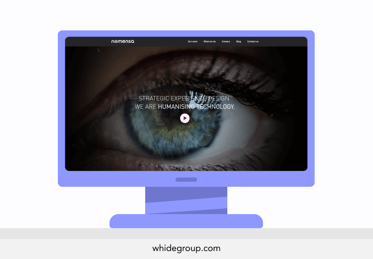
Being a top-notch UX design agency, Nomensa knows that following website compliance standards is an integral part of any solid user experience, which is clearly demonstrated on their own website. In the accessibility statement on their website, Nomensa declares they adhere to Level AA requirements.
Parramatta Park’s website can be one more source of inspiration for you to answer the question of how to make your website accessible. The website is about a major urban park in Parramatta, Western Sydney, Australia, which has fascinating importance to Australia.
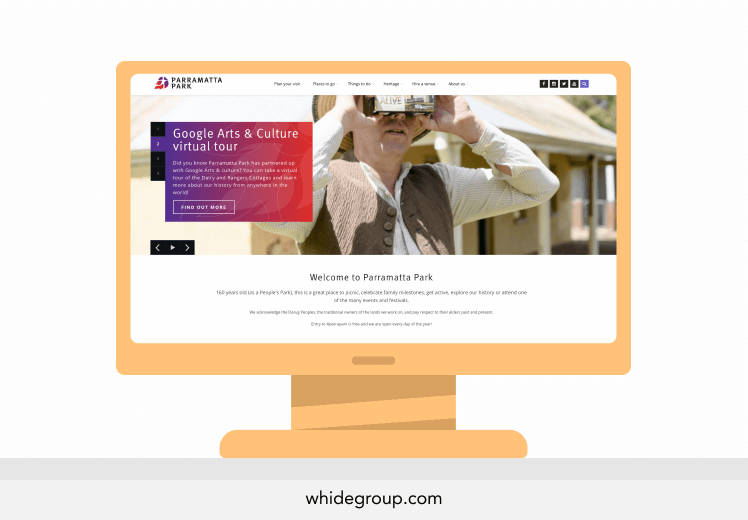
Vibrant and appealing, Parramatta Park knows well what makes a website ADA compliant, and thus the website can also boast a decent website accessibility features level! Taking care of the visitors with vision impairment, the website proudly employs bold colors, link styling, proper sized elements, right code structure, and alt tags for important images. Parramatta Park implemented accessibility requirements for the websites to a truly inspiring level!
New South Wales, or NSW Australia is the governmental website which masterfully combines usability and accessibility in web design stating their top priority is providing all categories of users with equal opportunities in terms of browsing the content.
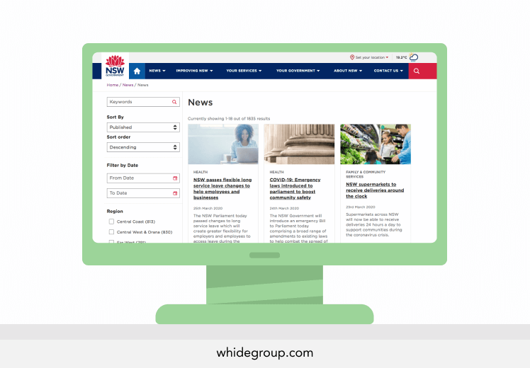
The website content is available to the widest audience possible. Following level AA accessibility principles, NSW Australia website implemented Australian government accessibility standards, offering their visitors keyboard-accessible functionality, contrast tuning features, and a convenient layout. Thanks to this, users that use assistive technologies to browse the website can enjoy fully-fledged access to all content provided!
As you can see by visiting the accessible websites examples mentioned above, making a website accessible is not some sort of crazy challenge. All you have to do is to bring some creativity and imagination to your project, right after you select recommended usability and accessibility practices for that website of yours!
Let’s learn how you can improve the accessibility of your design and the website in general by considering real examples. Recently, one of our clients decided to provide web accessibility options for browsing his website. To make this come true, we used Equalweb software, which provides 100% compliance with WCAG 2.1 – the latest web content accessibility guidelines available. The process of making the website available looked as follows:
As for the timeframes of the process – in general, we spent around 40 minutes for each page to implement accessibility features on the website.
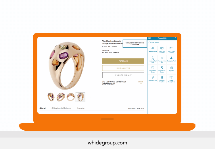
The final result after applying accessibility requirements for websites on the part of the user looks as follows: after accessing the website, visitors can see the disability icon with a caption inviting them to open the accessibility options menu. The menu itself is opened as a sidebar and represents features intended to make the website accessible. The features are represented as clear icons, which are also supplemented with text captions. The users can:
Due to visually impaired website compliance, visitors can use text readers, voicing all the text content on the page.
In this article, we’ve answered the following questions:
As you can see, implementing website accessibility best practices is not just a considerate thing to do for your wouldbe users, it’s actually vital in today’s realities. And by doing so, you’ll be able to welcome as many people as possible. Don’t miss your chance to ensure customer satisfaction along with growing your traffic and conversion rate by making your website compliant to digital accessibility standards.
At Whidegroup, we take the power of the web seriously, and thus strictly follow accessibility standards for websites, believing that everyone should have access regardless of disability. If you decide to work with us, you can rest assured that your website would be more than just usable. We’d give you an end result that was a delight to your users and a great source of pride for your business. Let’s make the world wide web accessible together!
Share This Article

 Shopify vs Magento 2: Which One Suits You Better and Why
Short, sweet, and to the point. Loved it!
Very well presented. Every quote was awesome and thanks for sharing the content. Keep sharing and keep motivating others.
Nice job!
Like the way you tell about it.