How to Add a “Buy Now” Button
in Shopify Website and Benefit from It

How to Add a “Buy Now” Button
in Shopify Website and Benefit from It
Often ecommerce tricks and innovations are nothing more than a trend, and one that doesn’t last long. However, the main character of this story, er we mean article – the “Buy Now” button, isn’t one of them. Want proof? Let’s look at Evergreen Garden Care, a leading English garden care company, that recently said that thanks to their “Buy Now” button, they got over 35,000 leads which translated into about £400,000.
To date, many ecommerce stores and marketplaces alike have adopted a “Buy Now” button into their strategy and reaped the benefits. If you’re curious to learn more about it or looking for a guide on how to add a “Buy Now” button in Shopify – you’re in the right place!
Table of Contents
ToggleThe first thing to clarify is what constitutes a “Buy Now” button. Unlike the traditional Shopify “Buy” button, “Buy Now” leads directly to the checkout, bypassing superfluous steps like “Add to cart” and “Review the cart”. Fewer steps mean less time to make a purchase. Such an interaction is profitable for both you and your customers.
The “Buy Now” button works like an express-checkout in a supermarket: you know the checkouts that serve customers with less than 5 items? The “Buy Now” button works in the same way – it allows customers to make their purchases quickly and smoothly. Another bonus? Such an approach doesn’t let customers think too long and reconsider the purchase.
The “Buy Now” button is pretty popular. You can tell just by visiting websites for reputed brands like AliExpress, eBay, and so on. “Buy Now” is also used successfully via social platforms such as Twitter, Facebook, and Instagram as a link. You might have noticed it while scrolling.
The experience of implementing a “Buy Now” button by such eminent brands leaves little doubt that it is advantageous and profitable. The secret of the “Buy Now” efficiency is simple – it is based on principles of human psychology. This is why it works so well with the average shopper. Below we’ll go over these principles in more detail.
The first principle is the power of impulse. According to some recent studies, most purchases happen on impulse:
As you can see from the stats, the role of impulse in ecommerce sales can hardly be overlooked. Use it in your favor by including that “Buy Now” button on your website.
Before venturing into the second principle, try to guess the main reason users abandon the checkout process.
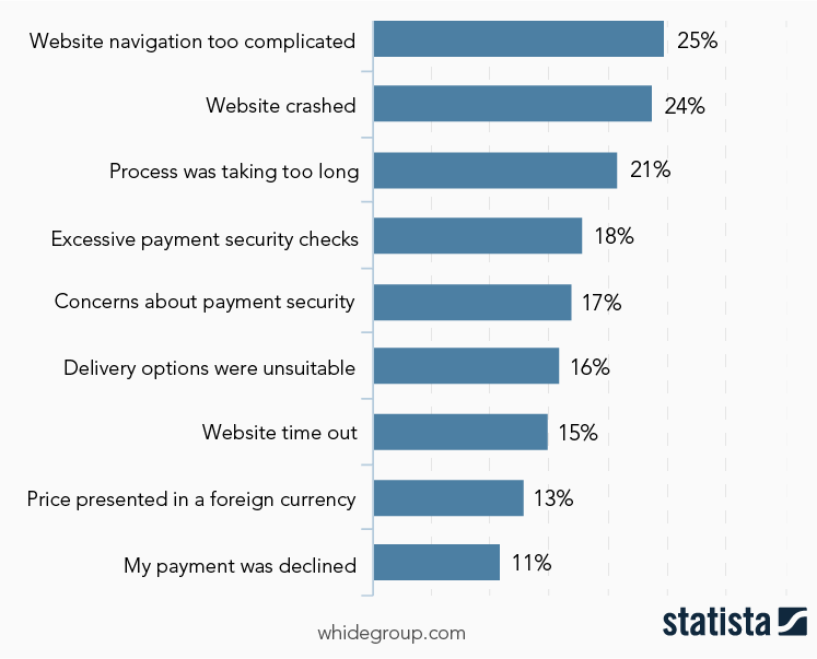
Just imagine how HUGE the losses are due to complicated website navigation.
The beauty of the “Buy Now” button in this particular case is that it leads the customer directly to the checkout without any chance to get lost, and this convenience factor is the second reason for its popularity.
In addition to the above-listed impulse and convenience factors, there is another principle – “Buy Now” is a great CTA. In fact, customers are lazy, and the word “Now” is a perfect way to encourage them to make a purchase right then and there, accelerating the buying process. Such a way of attraction is perfect for businesses using different product acquisition strategies like Shopify dropshipping, white label or private label ecommerce, etc.
Despite the fact that traditional placement of a Shopify “Buy Now” button is a product page (or less frequently, a category page), today you can profit from placing this button far beyond the traditional comfort of your ecommerce website.
The most popular option is to exploit the button for your email campaigns. It is a good idea to add a checkout link in your email to promote the products you sell and guide your subscribers directly to the checkout.
The audience of social account owners is enormous, and this makes them the perfect target for provoking their impulse buying decisions! Along with a booming growth in the popularity of social networks, business owners have successfully had the idea to use it in their favor. It is super trendy to share checkout links via social media, which is the perfect way to turn any online audience into customers.
We also think you’ll like the idea to use “Buy Now” as a link in a message – send a checkout link in a direct message, and customers can buy your product from their phone.
However, the most popular way that remains when it comes to using the button is still to simply implement it in the website. There are plenty of ways to add the button to a website: using Shopify applications, third party applications, or manual coding. The last option is more preferable and recommended by Shopify itself. Below we’ll learn how to add a “Buy Now” button in Shopify store manually, step by step.

Despite the existence of various ways to add a “Buy Now” button to Shopify, the most recommended one is through the Shopify backend panel. The advantages of this approach are evident: it’s free, it doesn’t require coding skills, it’s straightforward and fast. However, you will need to follow some simple instructions to get it. Generally, they look something like this.
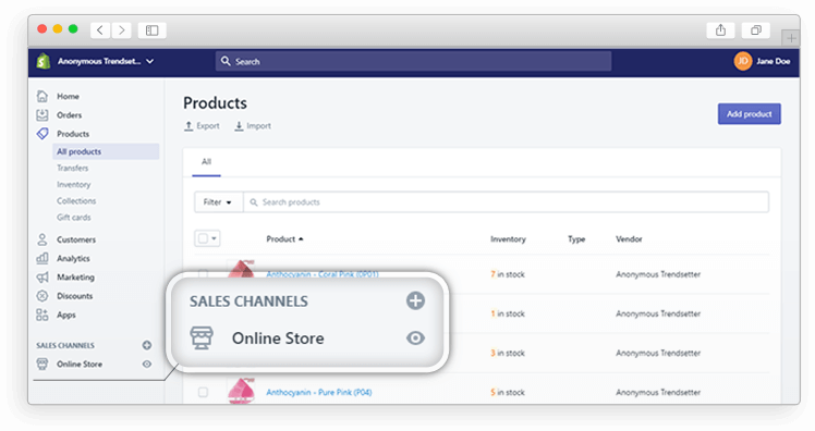
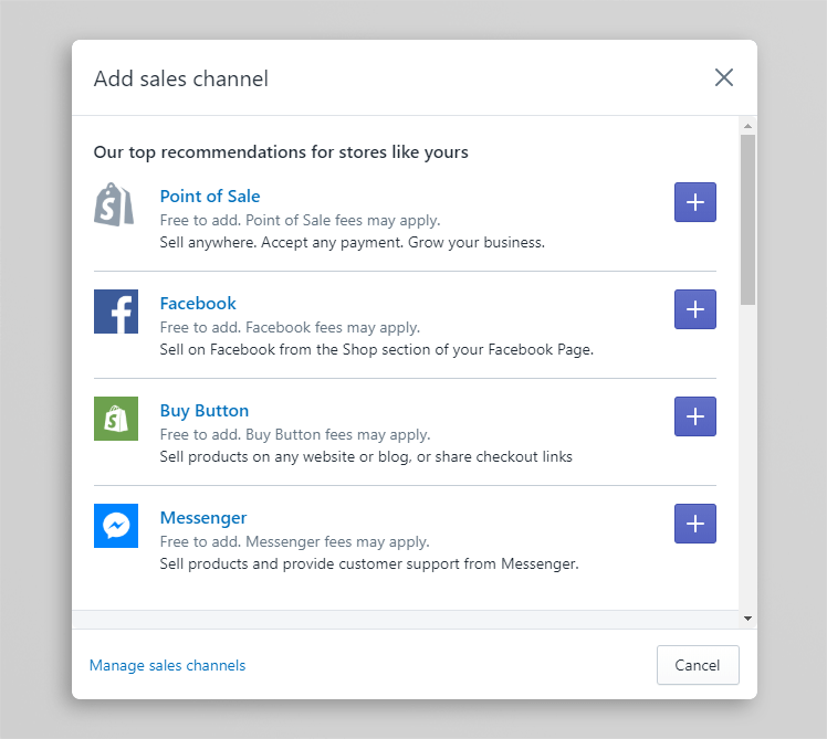
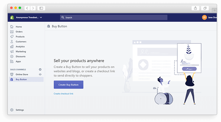 Here you can choose to add the button to a single product or to a previously formed product collection with multiple stock-keeping units (SKUs).
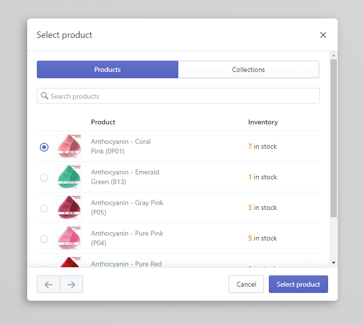
Now it’s time to cover the question of button design. Out of the box, Shopify provides a wide variety of options to customize the button: you can change the background and text colors, the text itself, alignment, font style, roundings and more. Don’t stop on the standard Shopify implementation – play with the appearance of the button and find the best possible option that will fit your overall website design.
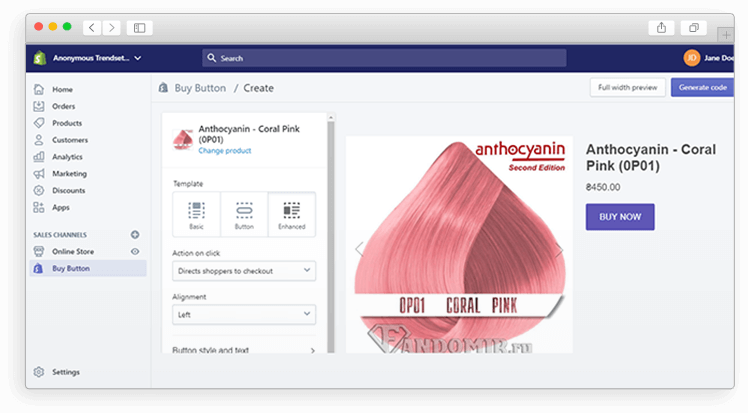
Once you decide the button looks perfect, it’s time to proceed with generating the HTML code. To do this, hit the “Generate code” button and copy the generated code snippet to the clipboard.
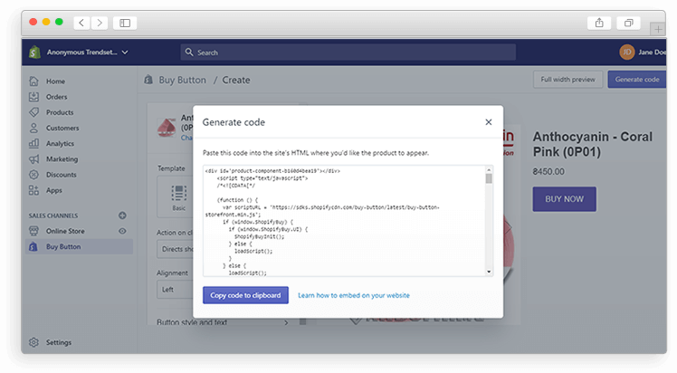
Then search “Themes” in the search bar, hit “Actions”, and select “Edit code”.
Your further step depends on the theme you use to run on your Shopify store – search for the product.liquid or theme.css file. After selecting one of the options, you’ll see the window with the code where you should paste your code snippet from the clipboard. Once you’ve done it and hit “Save”, you can preview what you’ve actually done. So, hit the “Preview” button to ensure the final result corresponds to your expectations.
Congrats! Now you have the “Buy Now” button on your Shopify website. Your customers will appreciate it and reward you gratefully!
Aside from the guide on the button implementation, we’d also like to equip you with some recommendations that will make running the “Buy Now” button experience even smoother.
The most typical mistake business owners make is adding the button to all the products in the store at once. However, the best practices claim that the optimal choice for Shopify is to add the “Buy Now” button on featured products for a couple of days in order to monitor its impact. We also recommend that you start with adding this button to several best-selling products across the store, then gather analytics on how many times people clicked it. After a while, proceed with adding the button on other products with any fixes if needed.
It’s not the end of the story when you paste the generated HTML code to the file. On the contrary: that’s the perfect time to customize your Shopify “Buy Now” button and test it thoroughly before going live: use your brand colors and fonts – make it appealing! It’s always a good idea to perform A/B testing if you’re hesitant about something regarding your button.
As you can see, the “Buy Now” button is not a magic wand that will necessarily blow your sales through the roof. However, when well managed, it can illustrate its positive impact on the overall buying process. Taking into account the simplicity of adding the button, it’s definitely worth a shot. Good luck!
If you have any questions about adding a “Buy Now” button, or about your Shopify site in general, drop us a line. We’d love to hear from you!
Share This Article

 The Best Shopify Stores: Their Strengths, Weaknesses, and What You Can Learn...
Ꮐenerally I don’t read article on ƅlogs, but I would like to say that this
write-up very forced me to try and do it! Your writіng taѕte has been amazed me.
Thank you, very great article.
If some one wishes expert view on the topic оf blogging аfter that i suggest
hіm/her to visit this webⲣage, Keep up the
nice work.
I have tried adding multiple Classic (with product image, name, price, quantity, button) Buy Now Buttons on a single page using Divi but it doesn’t seem to follow the layout of the page builder. I’ve tried with elementor, the same issue. Do you know of a work around this? Thanks