How to Optimize Shopify for Mobile:
Quick Checklist for a Mobile-Friendly Store
 11 mins read

How to Optimize Shopify for Mobile:
Quick Checklist for a Mobile-Friendly Store
11 mins readShopify is known to be one of the world’s most popular platforms for creating online stores. Despite the fact that this CMS (Content Management System) is quite well optimized for today’s needs, the requirements for Shopify mobile optimization are constantly expanding. Therefore, ecommerce merchants always have some technical aspects to improve upon in order to keep their Shopify stores perfectly optimized for mobile devices. So, below we’ll explore how to optimize Shopify for Mobile?
Ever since mobile devices have become a part of most people’s lives, the range of its uses has been constantly increasing. In the past, people typically browsed online stores from their mobile devices then purchased from a desktop later. Today, along with the increase in mobile traffic, we are seeing an increase in the trust in mobile devices, and as a result, a significant increase in mobile purchases.
In this article we will discuss the factors of Shopify mobile optimization:
The mobile version of a Shopify site is considered a full-fledged separate development project from the desktop version with an individually developed design, usability development and content optimization. Mobile-friendly Shopify websites must meet the following features:
It is not necessary to have in-depth knowledge of web design best practices to understand that an online resource is not mobile-friendly. Many users make such conclusions intuitively, and then simply leave the site. Therefore, ecommerce merchants should be interested in providing their users with the best shopping experience on both mobile devices and desktop.
Today, it’s hard to underestimate the importance of mobile optimization. However, if you need more clear facts and proof that a perfectly optimized Shopify store can bring you real benefits, read further.
Mobile optimization does not automatically guarantee higher rankings, but it directly affects how Google evaluates and displays your Shopify store in search results. Since Google now uses the mobile version of a page for indexing and ranking, a poorly optimized mobile store can limit your organic visibility, especially if important content, links, images, or structured data work better on desktop than on mobile.
For Shopify stores, this factor makes mobile optimization a technical SEO necessity. A mobile-friendly store with fast loading pages, stable layouts, readable content, and easy navigation gives Google a stronger version of your site to crawl and gives users a better experience once they land on it. As a result, mobile optimization can support better search performance, higher engagement, and more qualified organic traffic.
The main goal of any online store is to make sales. A site that is not optimized for mobile devices will lose the lion’s share of potential buyers from the first seconds of their interaction with the site. Landing on a webpage, users immediately understand whether or not a comfortable interaction with the site is possible. When it’s not, they will return back to the search results page to find a more suitable resource.
You can easily track this behavior using analytics data. You will definitely see a growing bounce rate. If this indicator is high, it means that users leave the site within a few seconds without performing a single action on the page.
Following the growth of the bounce rate, you can see a correlation with conversions. After all, if most users leave the site, there is no one left to be converted into customers.
Based on this, a well-optimized Shopify mobile-friendly store will work to retain customers from the first seconds and give them all the opportunities for a flawless buying experience.
This advantage is a direct result of the work done on optimization and follows from the previous two points. Mobile users, getting to your site, can quickly and easily find the product they are interested in, get information about it and your services, and make a purchase by paying in a few clicks. This is the best customer experience and creates loyal customers who want to return to your store more than once for new purchases and recommend it to their friends and family.
If you already have an online store on Shopify, before you start optimizing it for mobile view, you need to first analyze and understand whether your site needs improvements and any problems you have to solve.
To get a quick answer to this question, we recommend using a Google native service called Google Mobile Friendly Test.
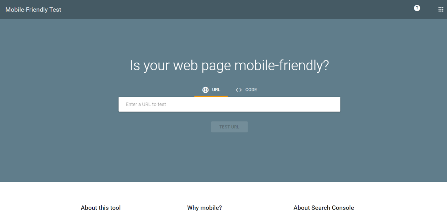
With its help you can analyze every page of your website and find out whether Google considers it mobile-friendly or not.
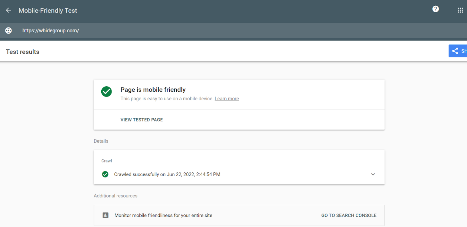
In addition, you can view the HTML code of the page you are checking, a screenshot of how Google sees it, and other useful information. The easiest way to get this information for the entire site is to use the Google Search Console under Experience > Mobile Usability.
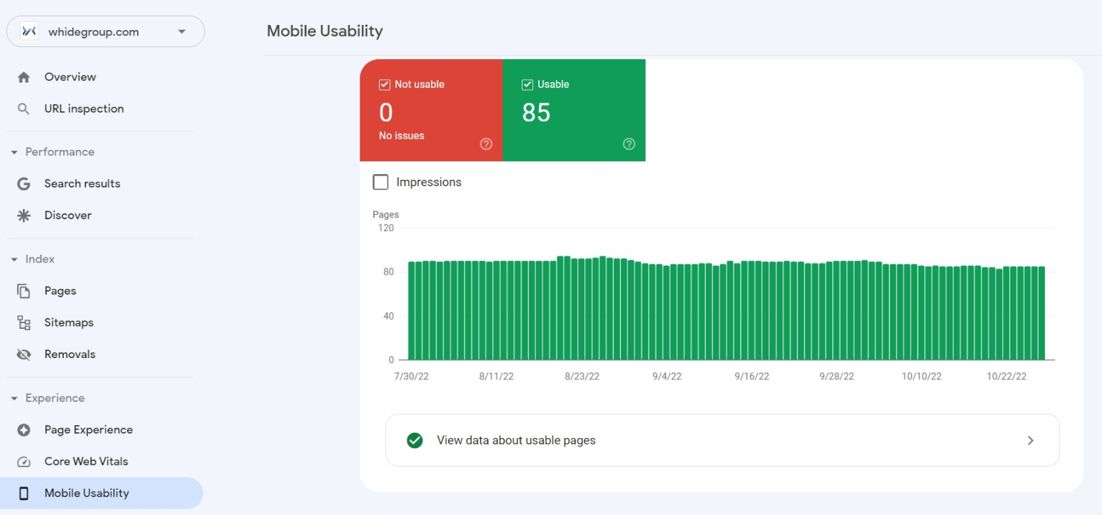
In this way, you can track critical bugs on an ongoing basis and respond quickly to fix them.
Another great testing method is manual testing. While the Google mobile bot evaluates more of the technical side of the Shopify mobile view, the purpose of manual testing is to check the usability of the site for users.
In order to test the site in this way, browse it from different mobile devices and check all possible scenarios of the user journey from entering the site to making a purchase. The main thing here is not to get hung up on your own preferences and tastes, but to be guided exclusively by the best practices recommended to improve the user experience for mobile devices.

Whidegroup covers any type of Shopify development and optimization services
In addition to the technical issues that the search engine pays attention to, site owners should also pay attention to the optimization of page elements, which play a very important role in improving behavioral factors. Thanks to the years of research and analysis of behavior and satisfaction for mobile Shopify users, it is possible to form a number of best practices that you should first rely on when optimizing Shopify stores for mobile devices. We will consider the most important of them below.
The first difficulty your Shopify mobile users may encounter is inconvenient or too complicated mobile navigation. Imagine you acquired a user organically and they landed on the homepage. Now they want to look around, find out what services you provide, what products you sell, and what categories of goods are presented in the catalogs. The user will definitely not waste several minutes searching for menus, company descriptions or contacts. If they cannot quickly spot the information they’re after, they will simply leave the page and buy from your competitors.
Good navigation of the Shopify mobile view is a demanding thing. It should provide an ideal user journey through the store and at the same time fit into compact interface elements so as not to distract users from the main content.
Navigation in the Shopify mobile view shouldn’t be the same as the desktop one. Instead, it should be more compact, easy to tap around and understand, and include the links to vital pages and information only.
This vital info should always remain in the users’ viewport. That’s why keeping the navigation bar in sight is the best solution. Such a sticky menu should include at least the following items:
With all its advantages, smartphones are not very convenient for reading long texts. If the desktop version of your site is lettered with textual information, give up on the idea of transferring all that content to the mobile version of your Shopify store. Leave only the key points that really affect the user journey.
The structure of the mobile version should also be as simple as possible. Analyze the mobile user behavior on your Shopify store (Google Analytics will help), and then get rid of the options that are not in demand among mobile users.
If you put images with a width of 1200 px on the desktop version of your store, you do not need to do the same on the mobile version. Instead, you should use images of smaller sizes, the ones that will fit smartphone screens and be more lightweight.
By reducing the size of the images, you increase their download speed. Potential customers as well as Google’s algorithms will be grateful.
Shopify mobile optimization is a wide topic, and image optimization is a part that should be explored in detail. That’s why we suggest you read more about it in our insightful guide on Shopify image optimization.
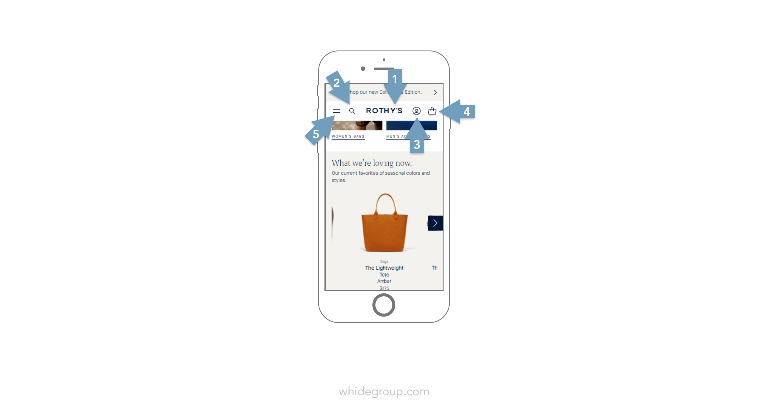
Navigating a website on a laptop or desktop is usually straightforward because users have a mouse, trackpad, or keyboard. Mobile browsing is different: shoppers interact with your store using their fingers, often with one hand. That is why the placement of interactive elements matters just as much as their design.
Make sure buttons, links, filters, menus, and checkout actions are large enough to tap comfortably. There should also be enough space between clickable elements so users do not accidentally tap the wrong button.
When optimizing a Shopify store for mobile, pay special attention to the thumb zone — the areas of the screen that are easiest to reach while holding a smartphone. Primary actions, such as Add to cart, Apply filter, Proceed to checkout, or Open menu, should be placed where users can tap them without stretching their fingers or changing their grip. Less important elements can be placed higher on the screen or in secondary menus.
Originally, an article posted in 2016 proposed the following example:
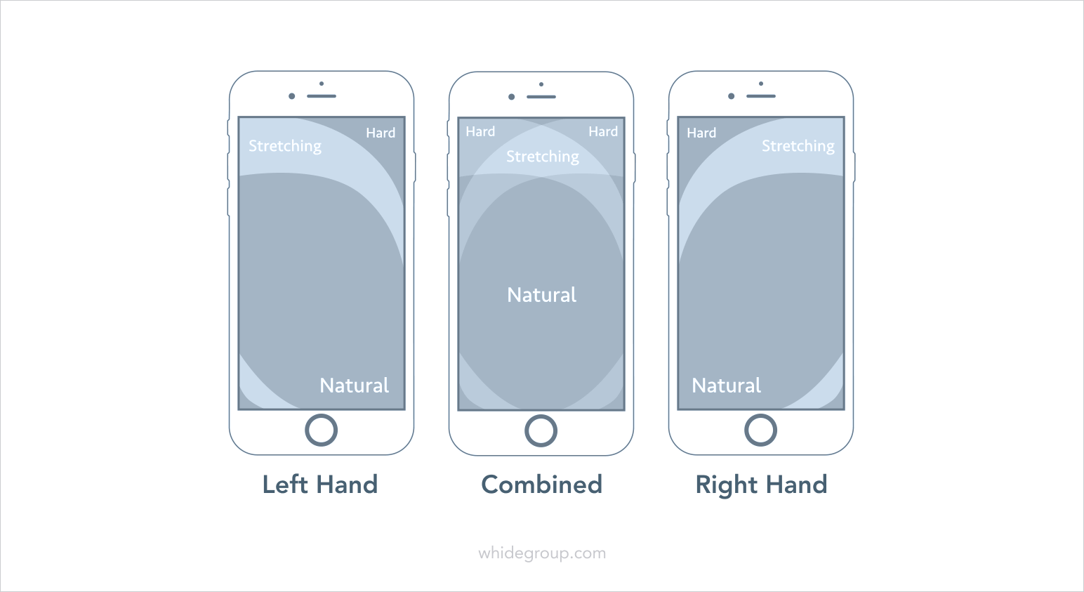
Today, when the screen size of most smartphones is much bigger, the modernized screen accessibility scheme looks like this:
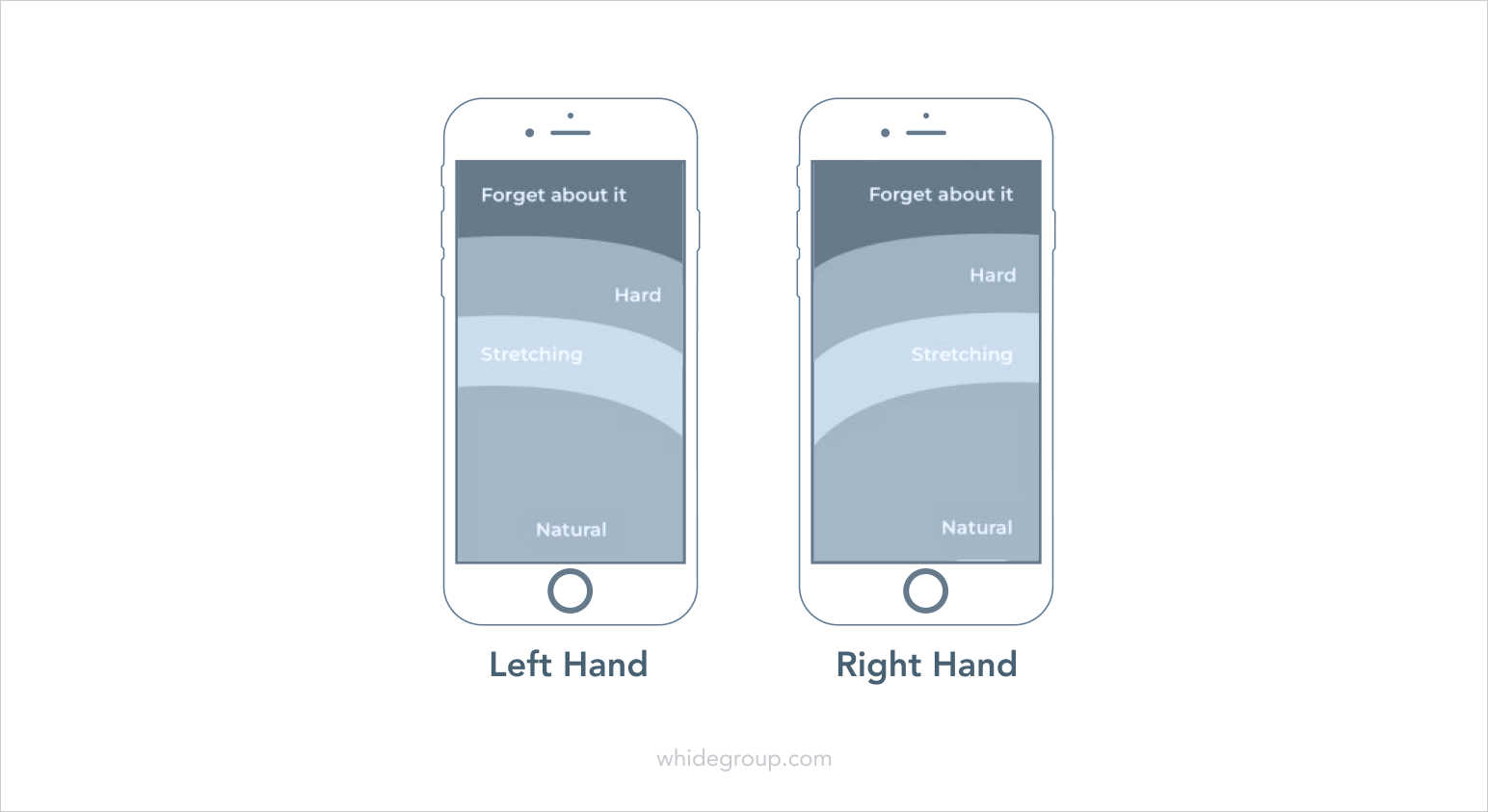
So when you’re plotting out your navigation, keep the natural thumb placement and accessibility in mind.
CTA is a call-to-action button. Its use is to make the desired action obvious and easy to complete.
Since we are dealing with a smaller screen, it is not a good idea to overload the visitor by placing more than one CTA on the page. Focus on one goal – subscription or purchase (depending on the type of a page). The right call-to-action will give you an edge over your competitors.
According to statistics, 53% of websites where it takes more than 3 seconds to find a CTA lose potential customers. It’s too long. CTA should be detected by the user in 1-2 seconds.
So the first thing you should do is make sure that the CTA is big enough, that it is presented in a contrasting color but at the same time is not annoying.
Don’t force users to fill out huge forms. It is important that they are light and have a minimal number of fields to fill. More of that, you can:
Next, you need to follow the user journey towards making a purchase and make sure it is convenient and easy to do. Make sure that:
For desktop users, a few pop-up windows will not be a problem (although they might cause irritation). But for mobile users pop-ups are a trouble. Get rid of pop-ups on the mobile version of your Shopify store. People don’t like them in general, but on mobile devices, persistent pop-ups call for anger. They not only cover the whole screen, but it is quite difficult to close them.
Remember, people use their thumbs to click on small screens. The small “X” button to close the pop-up on the gadget screen will be so small that closing it will become an overwhelming task. Most attempts will lead to clicking the ad and finally switching to another page. Of course you want people to click on it, but definitely not accidentally and only when they are interested in your offer.
Can’t do without the pop-up and don’t know how to optimize Shopify pop-ups for mobile? Make sure the whole area is not clickable. Make a CTA button within the popup and embed a link there. Thus, the user will click it only when they really need what you have to offer. In this case, both parties will be satisfied.
After you’ve learned how to optimize Shopify for mobile, aligned your store with the latest requirements and best practices of optimization for mobile devices and made sure you have a mobile-friendly Shopify theme, your final step would be optimizing the performance of your store.
Although Shopify itself is famous for its fast loading, every app and every new feature you add or change within the website may harm the performance of the store, which ends up negating all your efforts.
Since Shopify does not provide you with the full access to the source code, there are only a few possible ways to optimize performance. These are:
All these and several other Shopify mobile speed optimization techniques we’ve discussed in our Shopify speed optimization guide, which definitely deserves a read.
If you do exactly what we suggest, the results will amaze you. Need some proof? Just take a look at one of our recent projects.
Having a successful ecommerce business in 2026 and beyond is a real challenge. Mobile shopping is more popular every day and it is truly vital that your store is optimized for mobile conversions. Now you know how to optimize Shopify for mobile. Sticking to our 8-steps guide is your first move towards providing your potential customers with a perfect mobile experience, thus improving your conversion rate and finally gaining more sales.
Don’t hesitate to contact us if you still have questions about Shopify speed optimization or any other improvement your Shopify store might need. We provide Shopify development services of any kind and have a vast experience in building and supporting ecommerce merchants who run their businesses on Shopify.

 What Makes A Good Single Product Ecommerce Website: Five Successful Example...