The Most Beautiful Fashion Brand Websites:
How to Make Your Online Store Stand Out in 2023
The Most Beautiful Fashion Brand Websites:
How to Make Your Online Store Stand Out in 2023
Share post
There are three responses to a piece of design – yes, no, and WOW! Wow is the one to aim for.Milton Glaser
In ecommerce, users only need about 50 milliseconds (0.05 seconds) to form an opinion about your online store. They will immediately decide whether they like it or not, and whether they should stay or leave. Therefore, making the first impression a good one is crucial. So, you have less than one second to convince customers that they have landed in the right place. Implementing an incredible website design is the best way to make a great impression on visitors and keep them around.
In the apparel industry, the first impression is even more critical. The best fashion brand websites apply the latest design trends, predicting their customers’ needs and preferences. So if you want to build a successful business by selling apparel online, the first thing you should think about is implementing a thoughtful website design, able to build your brand awareness and instantly attract your customers’ attention.
Even if you sell top-notch fashion products, that alone is not enough for successfully setting your own brand, and thriving in today’s highly competitive market. When working with styled.dk, becksondergaard.com, and other apparel ecommerce businesses, we’ve had a chance to peer into some insights into the apparel business. While it’s true that a strong website design is crucial for any ecommerce business, its importance is multiplied when it comes to selling fashion apparel and accessories online.
Table of Contents
ToggleAppearance is everything in the apparel industry, which is why it is so important to have a solid idea about the focal points of the website, and to make smart design choices when working on the UI/UX design of your online store.
First, consider some of the results gained from eye-tracking research. This research aimed to obtain data about the elements of the target website pages and online forms that attract the most attention.
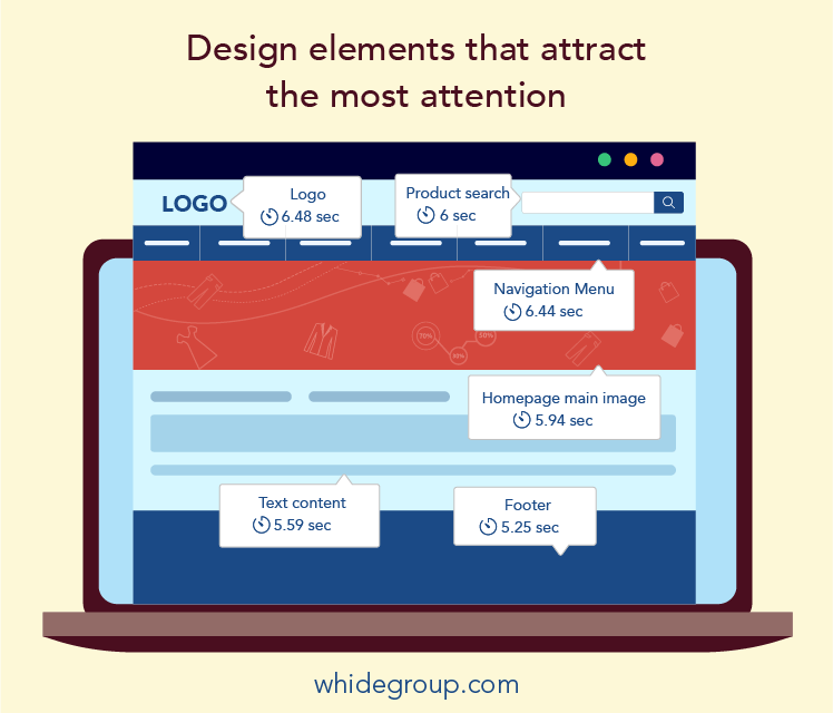
Now that you know the critical elements, it’s time to find out what design solutions are trending in 2023. Here are several of the most popular design practices prevalent among today’s top fashion websites:
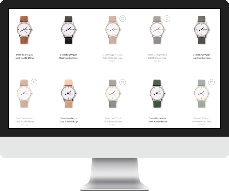
This is not necessarily a trend. Rather, it is one of the community-based approaches to website design. The main component of the concept is simply the abundance of free space, that allows to:
An overabundance of content negatively affects user experience. Mess kills conversion.
Another trend of online store design is paying particular attention to the site’s usability. UI/UX design is aimed at reducing bounce rate, and deliver great customer service and increase conversions and the customer’s journey, while smoothly guiding them to the purchase.
To do this, a designer must think through every detail, such as presenting a clear menu, user-friendly filtering, a visible cart icon, contrasting “Buy” buttons, and more. Everything should be logical so that the user can easily navigate through the pages, without experiencing the slightest difficulty finding what they are looking for.
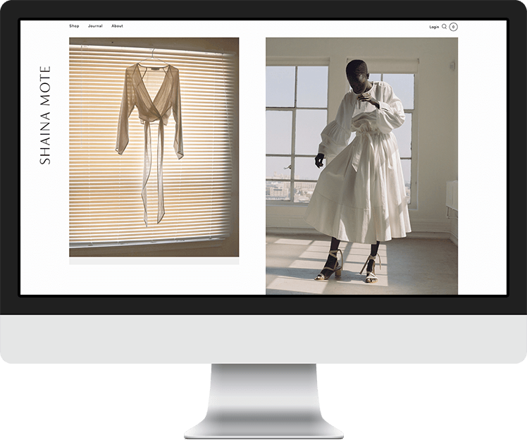
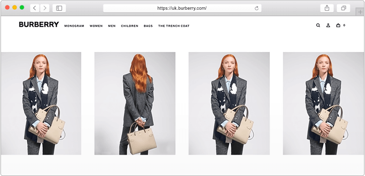
Lookbook pages on fashion brand websites may stand for a new way of organizing a product catalog or showcasing the latest collections. The immediate focus of this solution is to create a page with a set of blocks demonstrating the products. A lookbook layout smoothly adapts to desktop computers as well as to mobile devices.
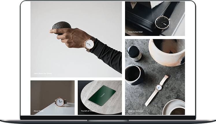
Instead of displaying products in a common way (photos from different angles complemented by a white background), consider using professional photos that present your products in real life. With the above example of a lookbook page in mind, it’s easy to see that this page design trick is more visually-appealing and enticing than a common, run-of-the-mill catalog.
Great high-quality photos are a proven way to make your site more attractive, captivating your visitors, and, of course, increasing your conversion rate. Professional photos always look clean and beautiful. For online stores selling fashion apparel, professional photo content is a must-have.
This is a powerful tool that helps keep users engaged. No matter whether it is a hover animation, sound effects, scrolling visuals, or any other type of charming microinteraction, it works perfectly. Although this trend appeared several years ago, today it is becoming increasingly popular, as we are seeing the best fashion websites implement them more often.
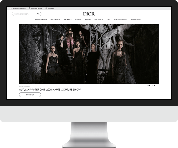
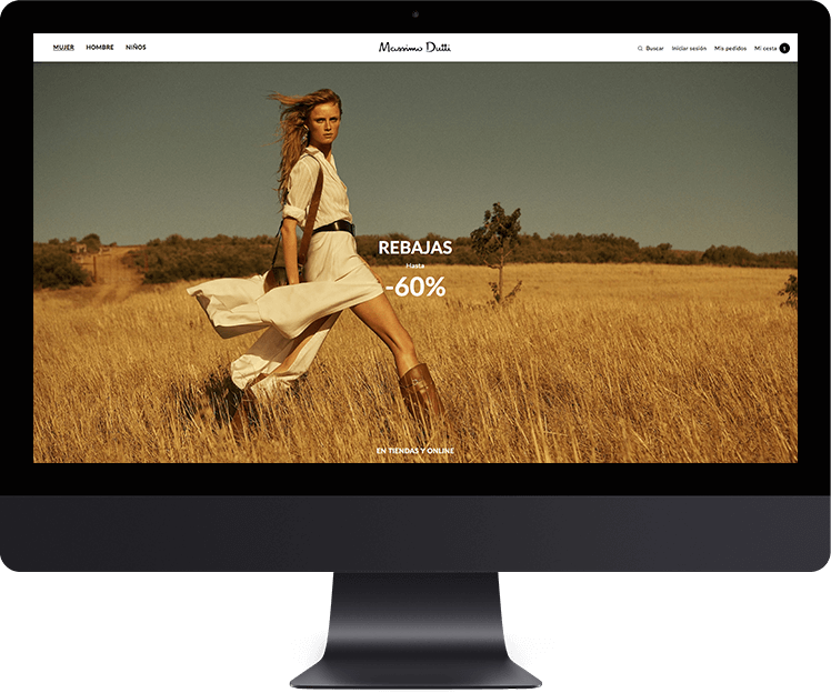
Utilizing beautiful, full-screen photos as a background is one of the most popular methods to attract visitor attention like a magnet. It does not require much effort, except the need to create an authentic photo that expresses the brand spirit and communicates the company’s values. A majority of the top fashion websites have already implemented this idea. Alternatively, others choose full-screen videos as the background.
Full-screen videos can quickly and effectively showcase the competitive advantages of the company, make website design unique, and increase customer engagement.
In fact, the idea to use background videos appeared several years ago. From there, its popularity skyrocketed, followed by a downward turn because the videos were not properly supported by mobile devices, which naturally led to a decrease in the website load speed. However, today’s mobile devices have much better performance than their predecessors, so video backgrounds have been brought back to life.
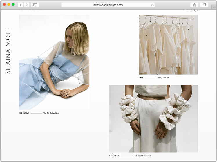
A traditional, uniform arrangement of blocks on a page is now considered rather obsolete. While it did not lose its effectiveness, thanks to new methods of presenting information within website pages, it can be significantly improved. Try to structure blocks on the broken grid method, somewhat randomly placing them across the page. This solution creates a new type of aesthetic which stirs the user’s interest and while still allowing you to stay within the corporate identity, sometimes even serving to make it stronger.
In addition to aesthetics, your online store should give plenty of useful information. Variable fonts impact the way the information is perceived by the customer and can either draw the reader’s attention or make them leave your site.
Custom fonts are trending! Today, for some stylish fashion websites, custom fonts have become part of their corporate style. However, if you want to apply a custom font or several of them, think twice before just adding a smattering of them as you wish because you risk letting your site look cluttered and ungainly. Fortunately in most cases, a couple of wisely chosen fonts can create magic for your design, without any negative impact on the website performance.
This trend is relatively new. It first appeared in 2016, further developed in 2017, and continues to evolve in 2023. Mixing different geometric shapes in the design of the website pages can provide amazing results. Properly chosen patterns and forms help to create a coherent and attractive composition, which will be highly appreciated by web shoppers. Even though 2D technology is gradually losing its popularity, yielding to 3D, such techniques can significantly refresh the design concept, making it up-to-date.
These are not GIFs that run wild on the internet. Rather, these are modern, static illustrations with partial animation. The cinemagraph is quite a new, fresh solution that should definitely be considered to play a part in lifting your online fashion brand store design.
If cinemagraphs are a novelty in the field of website design, then the GIF animation is a classic. Classics, as you know, never go out of fashion. GIFs capture attention and add even more motion than cinemagraphs do to otherwise static pages. Try this idea and see how well it portrays the main message of your brand. You just might love how much spice it adds to the appearance of your website.
Each of the presented design trends can be implemented in different ways. However, all these tricks should not be applied at the same time in the design of a website since each of them is a self-sufficient idea likely to be enough to develop a worthwhile project. On the other hand, in some cases, the mixing and creative processing of several of the described trends help to create a truly outstanding design.
To illustrate our points, we’ve chosen seven of the most outstanding and successful apparel websites. They have unique and authentic designs that follow modern design trends.
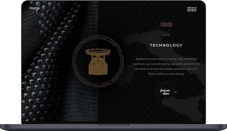
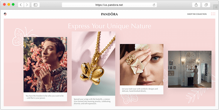
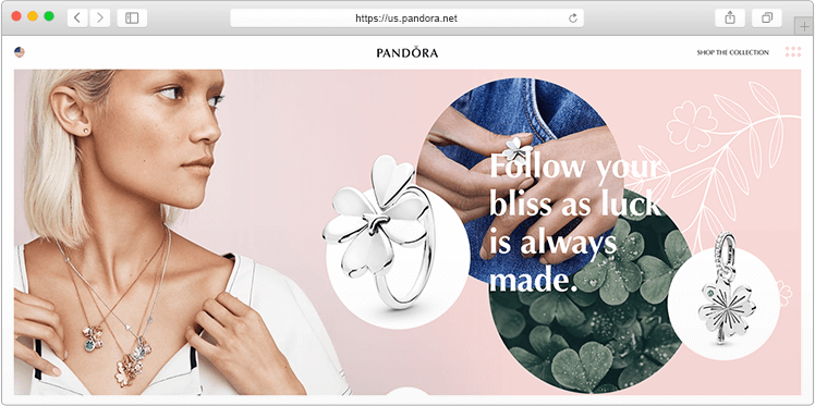
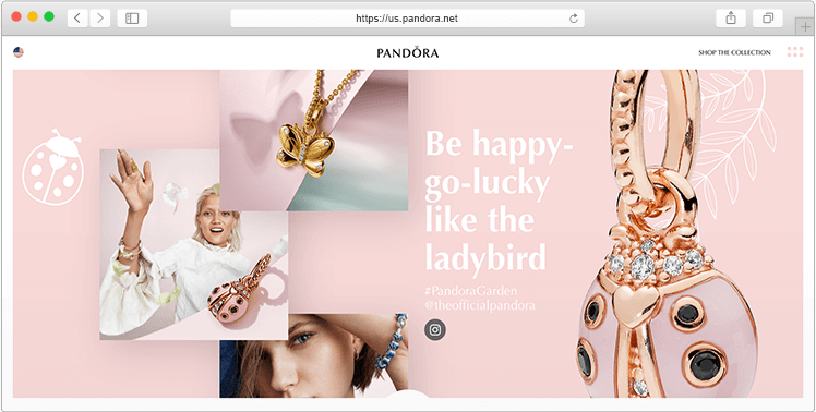
Actually, this is not an online store, but a landing page leading to the official Pandora website and integrated with the brand’s Instagram feed. However, we simply couldn’t just pass this by. This is a fully responsive site with several animations, videos, and other perfectly organized content that lead you to scroll further and further and refuses to let you leave. Other distinctive features of the website include:
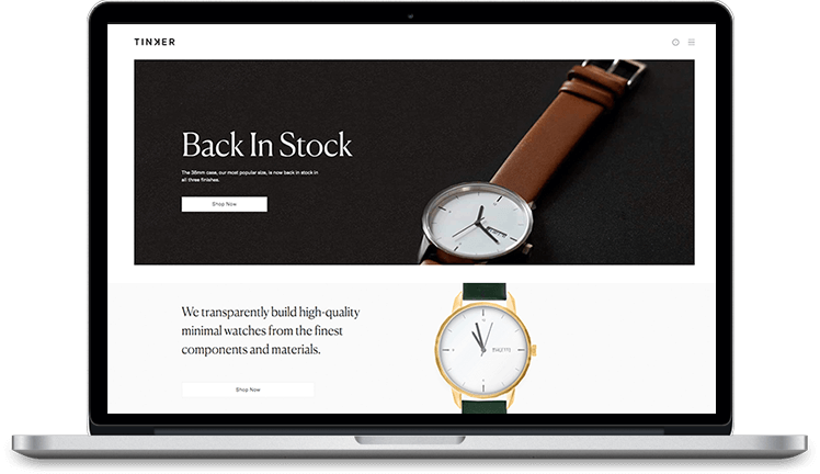
A beautiful design does not have to be complex or terribly flashy. Simplicity and minimalism are in trend. Therefore, a website’s design must be consistent with the spirit of the company. So that the corporate identity and image can be traced in every element of the website. Everybody prefers to land on beautiful online stores. Above all, this is why users tend to have more confidence in online stores that look respectable.
Each visitor to your online store wants to easily navigate throughout the website and find the product they desire in just a few clicks. For example, if your online store includes several hundred products, user experience can be improved by way of a multilevel catalog and user-friendly filtering.
Proper navigation increases the depth of site views. This increases the chance that more users will be interested in your propositions and will spend more time on your website. This, in turn, improves the indexing and gradually lifts your website to the Top 3 in search results.
Conversion is the most critical indicator of your business success. Competently implemented CTA elements help to turn casual visitors into loyal customers, thus increasing the conversion rate.
Naturally, outdated website design makes things worse. An abundance of heavy elements, confusing arrangements, disharmony in the color scheme, and standard or template solutions are all website taboos that will only serve to distract users and reduce the efficiency of your business.
Design is a key component of any online apparel store. It influences users and motivates them to dig deeper into the assortment. Forget about the days when users needed to just adapt to all the layout inconveniences. Now, business owners make best fashion website design decisions with the help of experienced designers specializing in the UI/UX and the latest design trends. With all this in mind, it’s time to look back at your own website design and decide whether it might benefit from any improvements.
After looking through the best fashion brand websites, you see that it is not easy to stand out and beat the market competition when it comes to online apparel. However, now you possess enough basic knowledge that will help you on your way to adapting trending features for the success of your new online store design. The only thing you may still lack is a qualified web designer who can assist with both professional advice and recommendations, as well as develop and implement top-notch website design for you. Interested in moving forward with your new website design? Drop us a line. We look forward to assisting you!
Share This Article

 Let’s Discover How to Start an Online Coffee Business
Having read this I believed it was very informative. I appreciate you finding the time and effort to put this article together. I once again find myself spending a significant amount of time both reading and commenting. But so what, it was still worth it!
Very soon this website will be famous among all blogging viewers, due to it’s pleasant articles
Thank you so much!