How to Reduce Bounce Rate:
Shopify-Specific Aspects to Fix
How to Reduce Bounce Rate:
Shopify-Specific Aspects to Fix
Share post
As an ecommerce business owner, you probably know the amount of effort and financial resources it takes to attract visitors to your online store. SEO, advertising, social networks, and other measures are often used in an attempt to drive more traffic. But why do people visit your site only to then leave without making a purchase? We can list at least 20 reasons for this frustrating customer behavior.
In this article, we won’t dip into traffic quality or advertising techniques. Instead, we will discuss the most burning website design issues that kill conversion and several times increase Shopify bounce rate. We’ll also tell you about how to reduce bounce rate in Shopify stores.
Table of Contents
ToggleThe Shopify bounce rate is the percentage of visitors who landed on a website page, but soon left the site without making any action.
The bounce rate is defined as the percentage of users who viewed no more than one page of the website or left it directly from the start page. The percentage is calculated from the total number of visits. To calculate your bounce rate, use the following formula:
Rb=Tv/TeRb – bounce rate Tv – the number of users who viewed one page Te – the total number of page views
The bounce is counted when:
The bounce rate is taken into account by search engines when calculating the rating, which affects the position of the website pages in the search results. A low bounce rate indicates the quality of the resource and its usefulness to users.
What is a good bounce rate for the Shopify store? Well, numerous stats and studies in this field tell us that the average bounce rate for an ecommerce store keeps between 20% and 45%. Rates that are above 20% can be considered as a phenomenon. On the other hand, bounce rates exceeding 45% mean that something is definitely wrong. So, the main question we concentrate on in this article is how to reduce bounce rate in Shopify stores.
Now, let’s dive into the reasons for high Shopify bounce rates.
The first step is identifying factors that currently affect customer behavior and prevent the success of your ecommerce business. We will then give you some clues on how you can fix them.
Navigation is one of the biggest online store design pain points that should be considered in terms of Shopify bounce rate decrease. Most often, navigation turns into a real problem for large online stores selling thousands of products. When customers land on your website and want to search for a specific product, bad navigation will push them away immediately.
What’s our point? Your Shopify store will not make your website visitors stay if they do not have the opportunity to find what they’re looking for without having to go on an epic search. Although there is no universal solution for all online stores, there are several recommendations that can help you.
A simple and clear catalog structure is the most critical recommendation that we stress. One must be implemented in every online store to obtain a good click-through rate and consequently low bounce rate. Organization is key – it is essential to divide all your products into main categories and subcategories. Also, all your products should be placed no deeper than the 3rd level of nesting so that your customers can reach their desired goods within three clicks or less. If your store’s assortment is extensive, apply catalog filtering.
Take a look at the website for Quad Lock to see a great example with how they structured their drop-down menu.

Such category organization allows users to reach their needed page with a simple click. This leads to customer satisfaction, and happy customers eventually enable you to see a bounce rate decrease.
People tend to pay the most attention to the beginning and the end of lists. Take advantage of this trick rather than building your menu blocks chaotically.
Believe it or not, sometimes customers don’t buy from a website and leave it just because they can’t easily find the “Buy” button. To miss such an easily avoidable pitfall, look at your website through your customers’ eyes and make sure that all CTA (Call-to-Action) buttons are obvious.
The ability to search the website is a must-have feature for online stores, especially those with a wide assortment. If visitors come to your website knowing exactly what they need, make sure there is an easy way for them to find what they are looking for without the need to click through the entire navigation menu.
Here are several additional tips on how to reduce bounce rate in Shopify stores with the help of user-friendly search.
Pay attention to the search capabilities and make sure to include the following:
Make the search faster and easier using the auto-complete feature. Once the user starts typing a search word, a drop-down list with the corresponding goods appears. You will benefit more if that drop-down list includes not only names of products, but also images.
This feature is especially relevant for online apparel stores. A user can specify attributes like size, material, desired color, and so on. This option significantly shortens the customer journey and lets them proceed faster to the order phase.
An excellent example of a site with a well-tuned search menu is Death Wish Coffee.

In this case, all the above tips have been successfully applied with the help of Searchanise, a multiplatform smart search app. Additionally, after clicking on the search icon, you see the drop-down menu with the most popular search queries, best-selling goods, and special offers.
CTA buttons are one of the most crucial tactics to use in the online store. The goal of every ecommerce store owner is to make sure CTAs are clicked by as many visitors as possible. If at that stage of website design you forgot to include CTAs or didn’t make them stand out from the page background, then your visitors may not see it. The worst case scenario? It may potentially end with them forgetting to purchase from your store because they’ll likely land on your website, and then leave, where they will just make the purchase on another site with a more obvious setup. To avoid this, you need contrasting buttons on the product pages, saying “Buy Now”, “Add to Cart” or something to that effect.
There are three main rules for the CTA design.
On the Ball and Buck website, these techniques are displayed to a T.
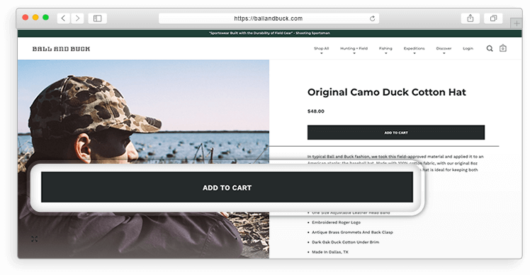
The black button on its white background, complemented by a clear call to action is what the customer sees first when they land on a product page. However, target audience segmentation will help you in creating the best CTAs. So, first analyze the needs of your clients and then personalize your UX copywriting.
Of course, checkout issues do not directly lead to higher bounce rates, but we decided to include them to our list. Although it will not count as a bounce, every little detail might indirectly influence the customer behavior and make them leave your store sooner or later without making a purchase. You don’t want it, right?
Even if the design of your site is impressive, all the blocks are in place, and the navigation menu leads visitors to the desired product page in a matter of seconds – it is still not everything. If your store has a confusing shopping cart and checkout, this is one more point to deal with for Shopify conversion optimization.
Consumers adore simplicity. They just want a straightforward and clear checkout process.
Unfortunately, the out-of-the-box checkout page in Shopify is not customizable. This leaves two possible decisions: upgrade your store to Shopify Plus or use one of the third-party Shopify apps, like Cashier, which allows customizing the checkout to your needs.
Here is an example of poor shopping cart button design.

The first question really is where is the cart? We don’t know either. As you can see, it’s not in plain sight. Rather, it merges with the rest of the text, leaving busy consumers feeling a bit perplexed and having to search for it.
This is what a good shopping cart button should look like:

Mandatory registration may seem to be an effective way to obtain additional data about your leads and customers. Some online stores go further and force visitors to complete registration to access the product catalog.
However, the reality is that such an approach brings a lot more harm than benefits. A test conducted by experts at Smashing Magazine showed that 100% of users negatively react when they are forced to complete a registration.
Let your customers choose. Enable guest checkout in your Shopify store.
Consumers understand that their email address is required for purchase confirmation, but they don’t want to be forced to log in. Besides, when ordering a product, they will have to submit their email anyway. Optional user registration gives your users a chance to make their own decision on whether they feel like logging in or not. People tend to react better when they don’t feel overtly pushed.
The huge advantage of brick-and-mortar stores over online stores is the possibility to communicate with the seller in person, ask questions, and get immediate answers. To hold the potential customers on your website and to not let them bounce, you need to organize the work of the online sales and support team in a way that a buyer does not feel the difference between shopping on-land and online.
Here’s what you can do.
Chat allows users to get an immediate response without leaving the product page. Marketing agency Econsultancy stressed that customers who talk to online support on ecommerce websites show the highest level of loyalty. The secret is simple: this type of communication helps the client quickly get answers to any questions regarding the characteristics of the goods or the conditions of the purchase and delivery.
As an example, look how The Modern Shop implemented this idea.
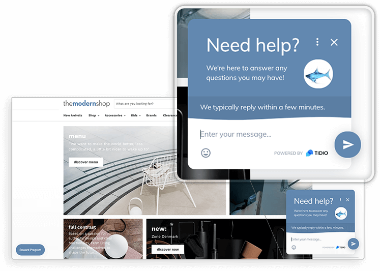
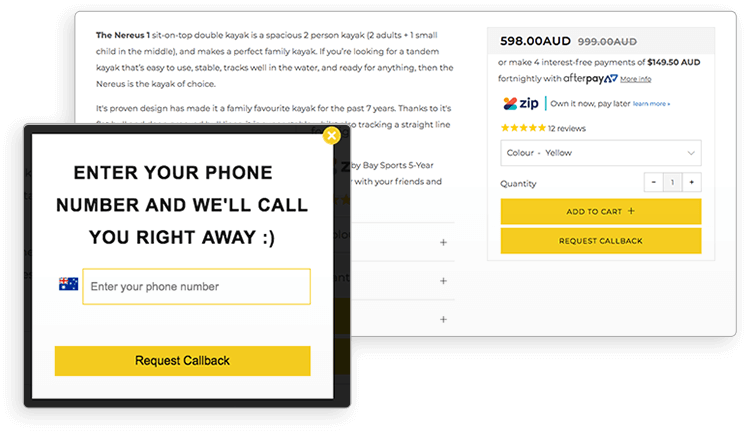
This type of CTA block is good for customers who do not want to call the hotline or type queries into the online chat. Thus, by submitting their phone number, customers will receive a phone call from your manager, or whomever else you designate, to answer all their questions or help them to place an order over the phone.
It will be better if you inform users about the precise timelines within which you will contact them, and add a countdown timer. If you say that you will call within 30 seconds, then make sure that the support team member can manage to respond to the request within that set timeframe. By doing so, you’ll make a lot of headway on the journey to the bounce rate decrease.
Recently Bay Sports found one of the most elegant ways of how to boost Shopify sales via adding a Callback button on their product pages. Check out how it looks and perhaps you’ll get inspired!
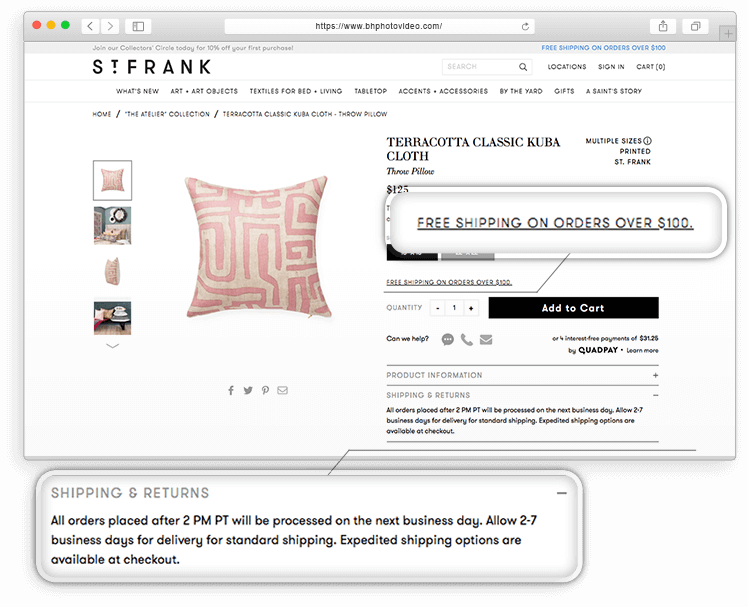
According to recent statistics, one of the primary reasons for shoppers to abandon their carts is expensive shipping. If the customer found the needed product in your store, the next question that interests them is usually “What are the payment and shipping terms?”
Of course, you have a Delivery and Payment Terms section somewhere on the site, but the customer still needs to find this page, which means leaving their current page or leaving your website to find the store providing full information in one place. They’ve already landed on your product page, you don’t want them leaving now. The shipping cost on your store may not even be that high, but if the customer only realizes at the checkout page that additional charges will apply, then you risk seeing a higher Shopify bounce rate.
The best approach that will help you in bounce rate decrease is to post information about possible payment and delivery methods, and terms on the product page. Thus, customers see the product description, its purchase and delivery options, and after that, they are free to decide whether all these terms suit their needs.
About 92% of visitors study company and product reviews before they make a purchase. 88% of them trust customer reviews as well as the recommendations of close friends and family members. Therefore, if there is no customer feedback throughout your store, it will be hard to increase the customer trust level and convince users that they should stay and explore your offers.
Product reviews also serve as a social proof of the quality of products you sell or the services you provide. So, we recommend that you do not overlook this opportunity to improve your store UX thus reducing Shopify bounce rate.
Customer reviews are a must-have on your online store. But where should you get them and how do you encourage customers to leave their feedback?
There are several possible ways. First, before you even say it out loud, posting paid fake reviews or writing them yourself is a bad idea. False feedback is easily recognizable. If you want your real customers to leave their feedback after purchase, you should somehow incentivize them. You can exchange their reviews for promo codes or discount coupons. Another option is to send them an email asking to spend a couple of minutes and share their experience with the product they have bought from you.
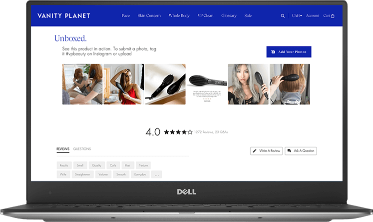
Reviews from social networks work twice as well. For example, Vanity Planet, an online store selling beauty gadgets, posts their customers’ photos from Instagram on their product pages. They manage this by simply pulling all photos that have a #VPBeauty hashtag in the description.
Important! You should not remove negative comments. Nonsensical? Yes – you may think so, but when there are no people in the reviews who are, at the very least, slightly dissatisfied with their purchase, it looks suspicious. Therefore, negative feedback is an opportunity to show how you solve problems and fix mistakes made on the part of the company. Be ready to apologize, propose possible solutions, and smooth out the consequences with gifts and discounts. Customers always prefer to see a responsive company rather than one that is happy to take their money and close the door.
In the US alone in 2022, mobile retail revenues are expected to amount to $431.1 billion. So, if your Shopify store is still not mobile-friendly, it becomes a main reason for high bounce rate. You are losing a significant chunk of potential customers who leave the website once they enter it from their mobile phones.
Luckily, most Shopify themes already have an adaptive layout and you likely don’t need to worry about this. However, to dispel all suspicion, make sure that:
If online shopping is somehow complicated, you must eliminate even the tiniest issue and make the mobile customer journey smoother and faster. First, think about replacing your Shopify theme with a new adaptive one.
Additionally, there are some other tricks you should implement to improve your ecommerce conversion rate:

As we have already stated, not every online store visitor is ready to make a purchase. Some of them add products to the basket to review them later, while others decide to leave the website without taking any action. In both cases, your potential customers leave without purchasing. However, it doesn’t mean that it is impossible to convince them to stay and buy from you.
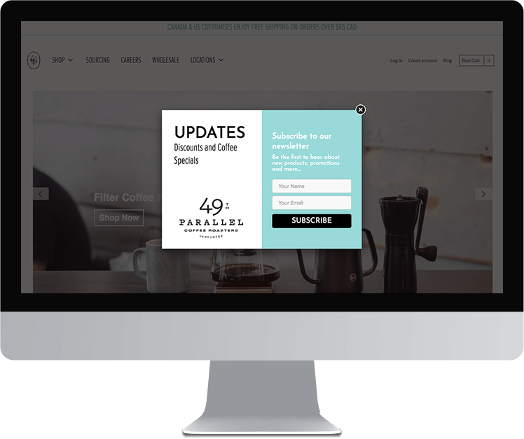
The best way is to create a pop-up message that will be shown the moment a visitor decides to leave your site. This message can tell a client about an advantageous offer, which becomes available once the user chooses to stay and finally submits an order. For example, you can offer free delivery, a discount for the first order, or at least ask the visitor to submit an email address so that you can notify them about your best deals.
Here is how the 49th Parallel Coffee Roasters engages their visitors:
A common cause of low high Shopify bounce rate is slow website loading. If the site is slow, visitors are more likely to close the tab. Marketing experts from around the world say that the site load speed should be close to one second or even less. In reality, most owners of big online stores with a large number of products can only dream of achieving such indicators, and are still interested in ways on how to reduce Shopify bounce rate and optimize a store.
Shopify site optimization for lower bounce rates and higher conversions should start with website load speed optimization. Analyze your online store with PageSpeed Insights or GTmetrix and identify the pain points which influence the website performance. Here is what you can do:
Recently, we helped one of our clients to optimize the site load speed of their online store built with Shopify and implemented all steps from our Shopify speed optimization checklist. As a result, the website load speed was halved, and the client stated that it increased the conversion rate in the Shopify store by 23%.
Often, customers interrupt the shopping process due to concerns about the security of payment processing.The Shopify store bounce rate won’t enjoy any increase if:
Buyers shouldn’t doubt the safety of your website. This is a hugely important aspect on how to reduce bounce rate in Shopify stores and drive more sales. So, after getting through previous points of our Shopify bounce rate decrease checklist, make sure that your online store also includes the following:
Not everybody gives meaning to these nuances, but it is important to comply with them. Otherwise, most customers will show you no trust and go purchase from other, more secure ecommerce websites.
Above we’ve considered the most efficient ways and methods to affect Shopify conversion rates. Concluding everything we’ve said, it should be noted that you may also like the option to implement the best free Shopify apps to increase sales. To learn this approach in more detail, you are welcome to read our article about top Shopify apps, where you can get inspiration about the best Shopify apps currently available on the market, and how you can use them to gain maximum profit.
Permanent Shopify bounce rate tracking, as well as numerous key performance indicators tracking, is a vital and indispensable process to run a successful ecommerce business. We recommend you not overlook it among other tasks and control this parameter. Shopify Google Analytics bounce rate tracking is a perfect way to keep your finger on the pulse of any fluctuations.
Running any business is a tough challenge, whatever industry you’re engaged in. Ecommerce business, being on the cutting edge of the high-tech industry, requires maximum proficiency and expertise from you. And it’s quite normal to ask yourself now and then questions like “Why is my Shopify store showing a high bounce rate”, “Why am I not getting sales on Shopify”, and so on.
Shopify conversion funnel tuning is a hard nut to crack, and it’s impossible to predict which one of these 11 listed conversion killers you need to eliminate first. Of course, this makes answering the question “how to reduce bounce rate in Shopify” a little tough. However, by implementing all of them, you can create an excellent base for building a profitable ecommerce business. Remember that any change you make to your online store must be focused on simplifying the customer experience and journey through the site. Thus, you’ll be able to answer the question easily.
The Whidegroup team has extensive experience in optimizing ecommerce stores and knows how to reduce bounce rate in Shopify and multiply conversions. We are always ready to cover the implementation of any technical aspect that will improve your online store. If you’re interested in learning more, drop us a line!
Share This Article

 Shopify Multi-Vendor Marketplace: The Brutal Truth No One Will Tell You
Comments are closed.