7 Ways to Improve Customer Experience
on Your Ecommerce Website

7 Ways to Improve Customer Experience
on Your Ecommerce Website
Share post
Armies of the best marketers and salespeople work day and night, competing against each other in order to win customer attention and interest. Each day brings more clever ways to make potential customer visits pleasant and comfortable by providing the best possible service with an eye towards encouraging consumers to come back.
So, what should ecommerce owners do to improve customer experience on their websites?
Take a look at some of the trending methods used to create better ecommerce shopper experience:
Table of Contents
ToggleIt is really hard to overestimate the importance of a mobile-first approach. There is even a separate term in the ecommerce industry – m-commerce. Mobile apps are ideal for enhancing customer experience on ecommerce websites. They give your visitors a one-stop experience where they can make in-app purchases, access special deals, and get specialized client support.
Before you begin to work on your mobile approach, it is a good idea to answer some questions first. Things an ecommerce business owner should consider are: What target audience will you design your mobile solution for? Are your customers experienced mobile users, or mobile novices? What encourages your visitors to use mobile phones?
One of the foremost functions that must be included on your mobile-first ecommerce website is a reliable search tool. The search icon must be visible and accessible on any screen size, and your user should be able to find needed information promptly and painlessly.
Another note – the possibility to pay for products from a mobile device is a big step towards making your customer’s experience more comfortable.
If you decide to build a mobile shop, make sure to properly test it. Regular testing is exceptionally important. You must consider that you will be offering the same content, but on much smaller screens, which may cause some user experience issues if it’s not well designed.

A convenient website navigation makes it easy to find needed information quickly and hassle-free. Furthermore, it dramatically helps search engines to index your content effectively. Poor navigation confuses visitors and frustrates them. When visitors can’t find what they’re looking for in your shop, they will leave and won’t come back.
To make navigation easier, you can offer separate and distinct categories, make product titles more appealing, and use the following methods:

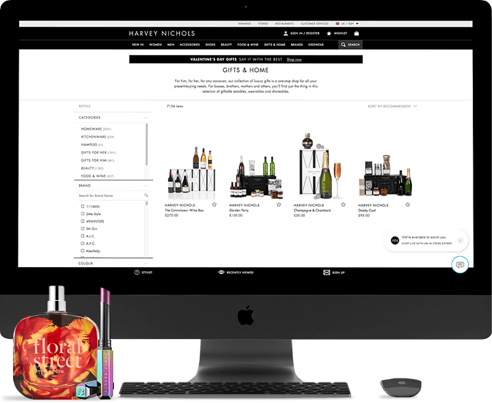
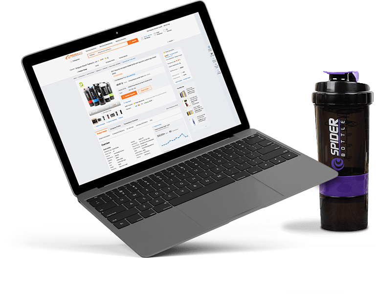
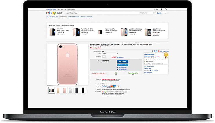
The first impression is everything for ecommerce websites. Bolster your customers’ first impression by choosing the most appropriate way to showcase your products. Every shopper is unique – some of them may prefer detailed product descriptions, others favor clear and appealing images. That’s why it is in your interest to provide visitors with every possible element about each product, thus encouraging your visitors to convert into your customers. You want to consider providing high-quality photos and detailed descriptions, 3D renderings and animations, 360-degree views and videos – and this is hardly a complete list.
A perfect product page should contain the following components:
Positive feedback from previous buyers significantly increases the credibility of your entire store so motivate your shoppers to leave feedback, record unwrap videos, or take real photos of products they’ve purchased.
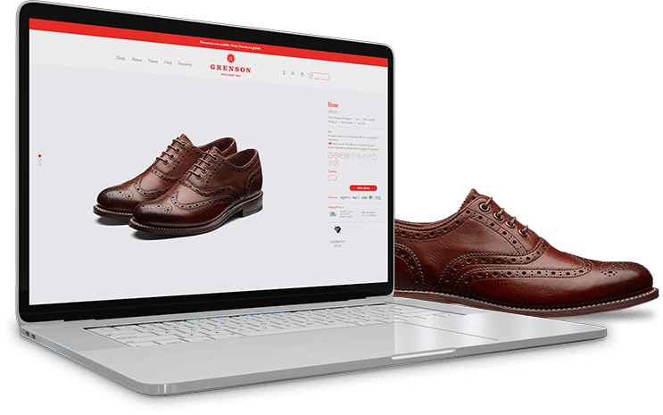
Checkout, the last step of the user journey on your website, is vital because this is when your customers make the final decision regarding whether your website is worth the product purchase. So, designing a stable and failure-free checkout process is key. A good, common practice of checkout design includes the usage of clean and minimalistic construct. You should include the links to your privacy policy, shipping details, FAQs, and your return policy should all be easily accessed from your checkout page. You may also wish to consider testing a live chat option on the checkout page in case the customer has any pre-sales questions before placing their order. It is also important to create a guest checkout option so your visitors are not forced to register an account for purchasing.
In developing your checkout function, it is highly advisable to avoid requiring too many steps while going through checkout, unclear error messages, and setting strict rules on the format requirements for data entry fields.
The most common problem for a majority of ecommerce websites, large or small, is abandoned carts. You can prevent this issue by fixing page load speed, offering a money-back guarantee, providing upfront information on shipping costs, and identifying any weaknesses in the conversion funnels.
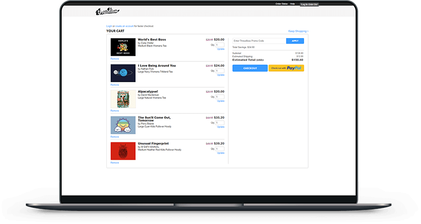
Customer service is an umbrella term which includes such things as design, client support, optimum price-quality ratio, and minimum load speed. Let’s look at all of them in greater detail.
Design plays a vital role: clean website design illustrates a solid and reliable company behind the screen, deserving of your trust. In order to achieve this, use only high-quality imagery and make sure they have similar styling to demonstrate consistency.
Regarding price-quality strategy – there are various ways to configure pricing for your online business. However, it should be taken into account that many pricing strategies can damage your customer’s view of your brand.
So, your customer may desire help at any point of their shopping journey. Provide users with various options of contact – live chat, phone support & callback, email, self-service support, etc.
According to Shopify research, 75% of users appreciate when a brand personalizes its messaging and offerings, and 74% of users become frustrated when content is not relevant to them. Personalised customer experience can improve conversion by 8%.

Several ways are available for you to personalise your ecommerce website: abandoned cart messages, displaying special offers according to customer location , targeted periodic emails, etc.
In addition to the methods listed above you may also implement automatic language detection (also based on geolocation), a wide variety of loyalty programs, analysing surveys, abandoned cart messages, etc.

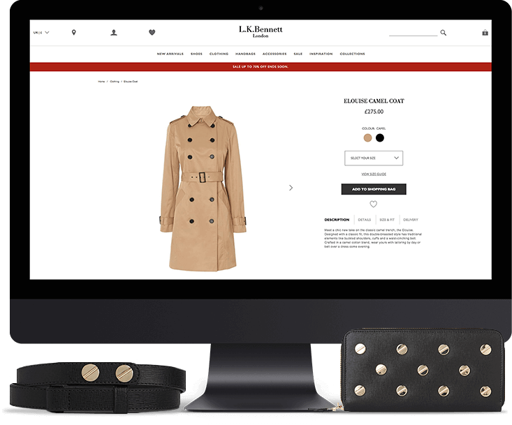
Shipping is often the “make or break” point of a consumer’s online purchase. If it’s too costly, not offered via their preferred carrier, or inconvenient in any other way, a potential customer is more than happy to abandon their shopping cart and look for what they want elsewhere.
Free shipping and fast delivery are often the final purchase considerations for buyers.
We often help our clients improve customer experience on their websites. For example, one of our clients, Kjellmann – a Norway furniture retailer, had some issues with the attractiveness of their website and needed professional assistance.
Whidegroup have developed the following features to improve customer experience:
You can learn more about Kjellmann right here.
Final Thoughts
Currently, client expectations are higher than ever and business owners are tasked with finding a surefire way to meet all shopper requirements. Consequently, as the customer becomes more empowered, the importance of the customer experience is increased.
Many approaches are available for you to improve the customer experience on your website. Define the most efficient ones for your e-store and implement them. The above mentioned list isn’t complete. In case you ask yourself “Well, what’s next?” – you still have a long way to go! Therefore, you can engage your customers with high-quality content and a wide range of products, implement referral programs, and use color psychology, increase website load speed, implement as many payment gateways as possible (debit cards, ATM cards, phone cards, payment in foreign currencies, or through Amazon, PayPal, etc), and provide shoppers with free returns.
Most of work in the field of customer experience improvement is not visible. However, if you continue to grow your store, take care of it, and focus on making your customers happy, they will reward you handsomely.
Share This Article

 Red Bull Business Strategy Explained
Hello.This article was really remarkable, especially because I was browsing for thoughts on this subject last Monday.
I think other website proprietors should take this web site as a model, very clean and great user friendly style and design. You’re an expert in this topic!